CASE STUDY
Design System
Scaling tokens, components, and patterns across all modalities in the customer journey.
One of the top online custom sticker and label companies was increasingly launching applications and features, both internal and external, but the experience didn’t always deliver the same interactions and visuals. I started the groundwork to create a web style guide and design system to scale the experience of the brand throughout the website, customer account, and internal systems.
Role
UX Lead
UI Designer
Responsibilities
Token and component design
Collaboration with product and marketing teams
Stakeholder reviews
Timeframe
JAN – MAR 2024
Problem
Challenge
Assets
Tokens
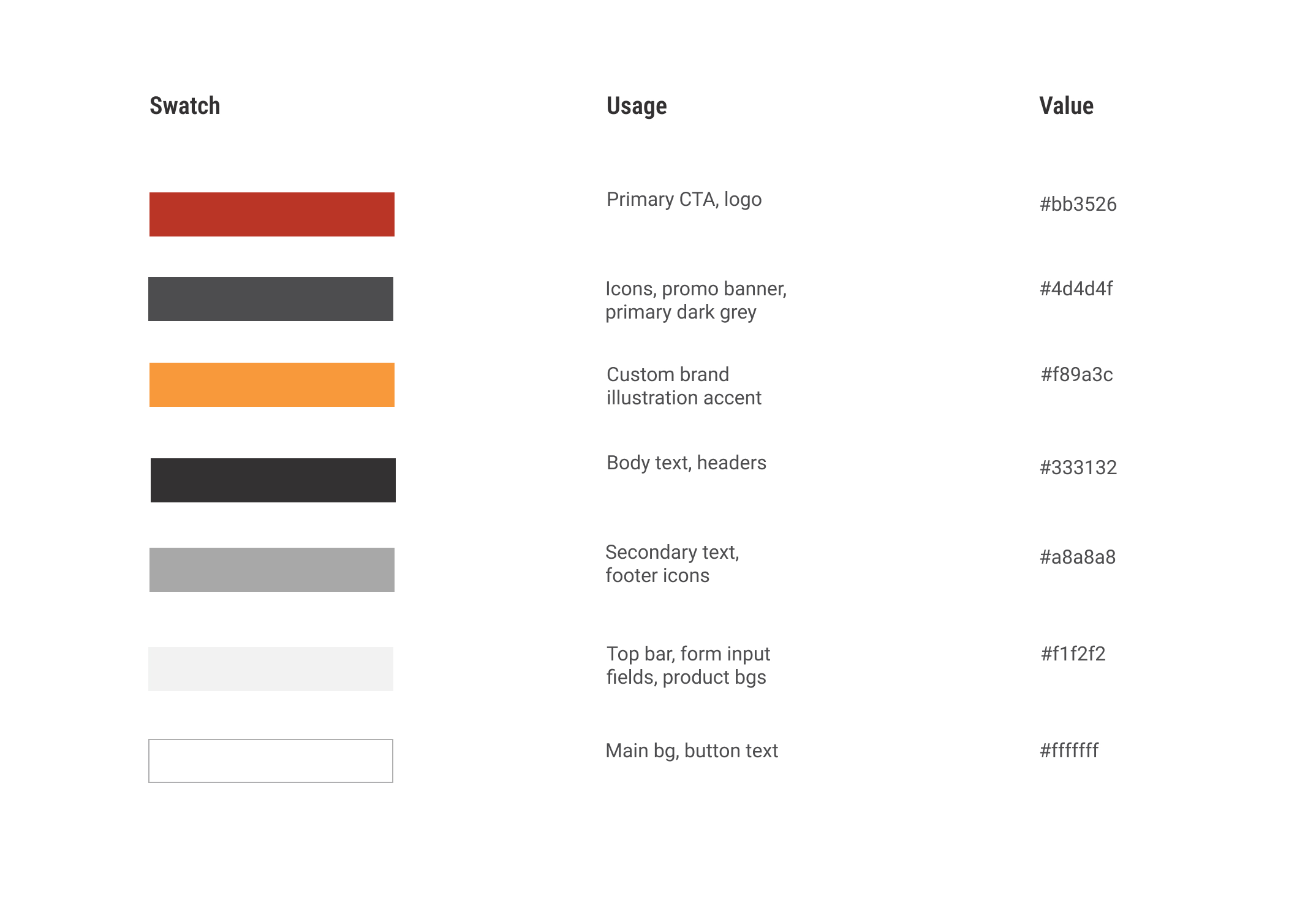
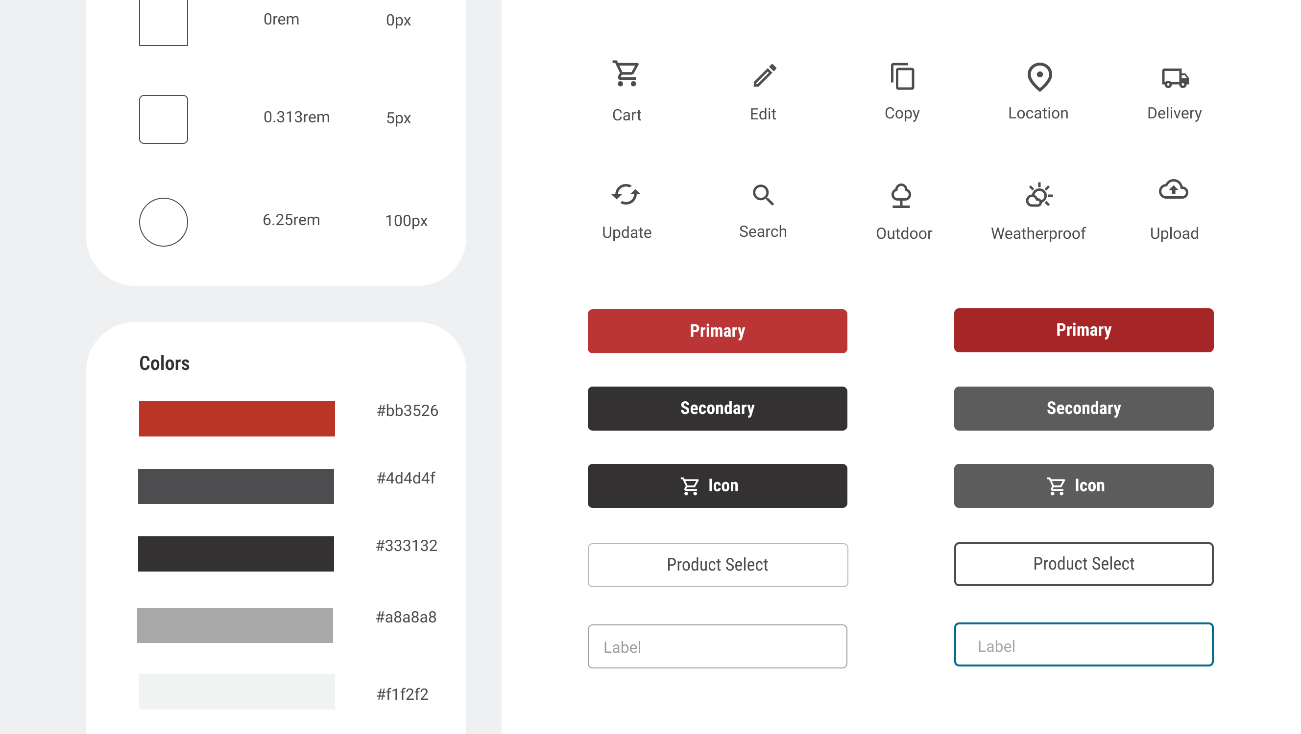
The color palette and visual style in the marketing brand guide was limited, and didn’t account for dynamic UI, various states, and interactions across the ecosystem.
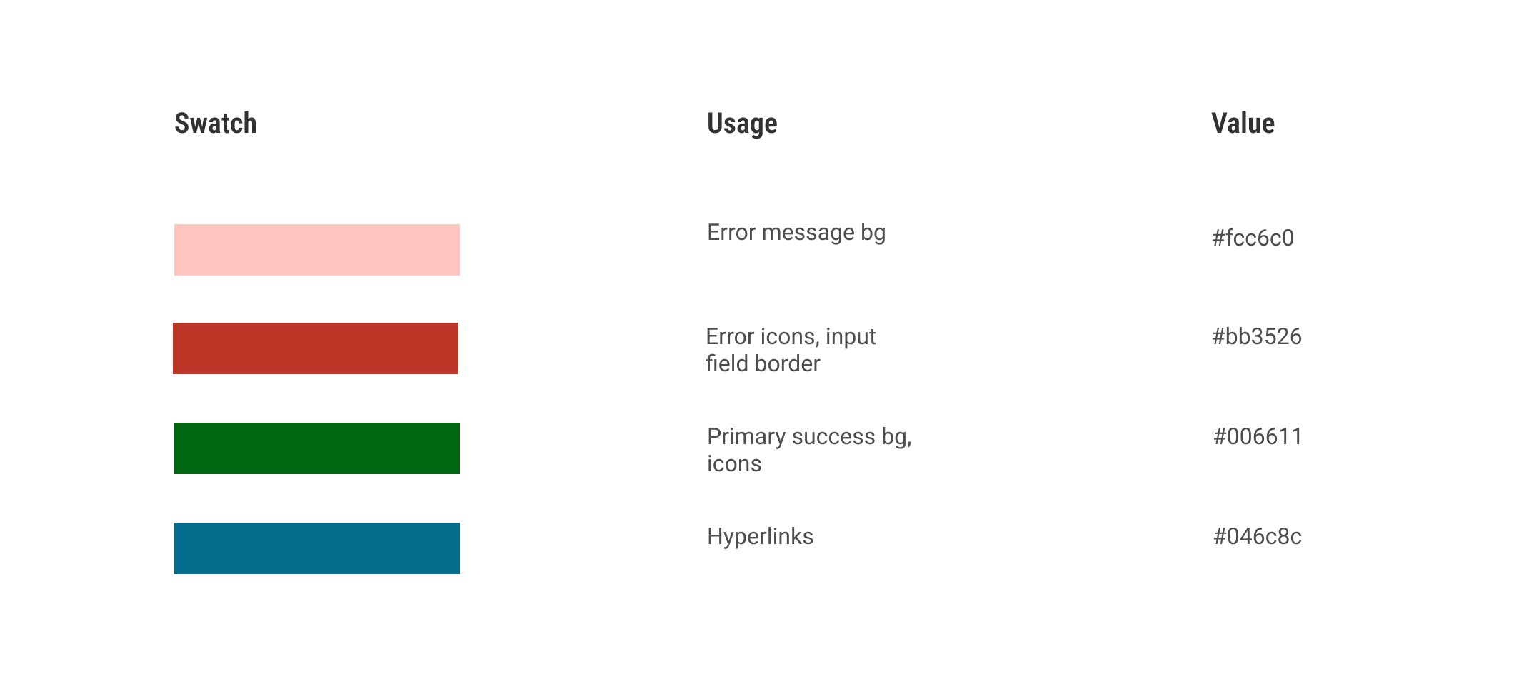
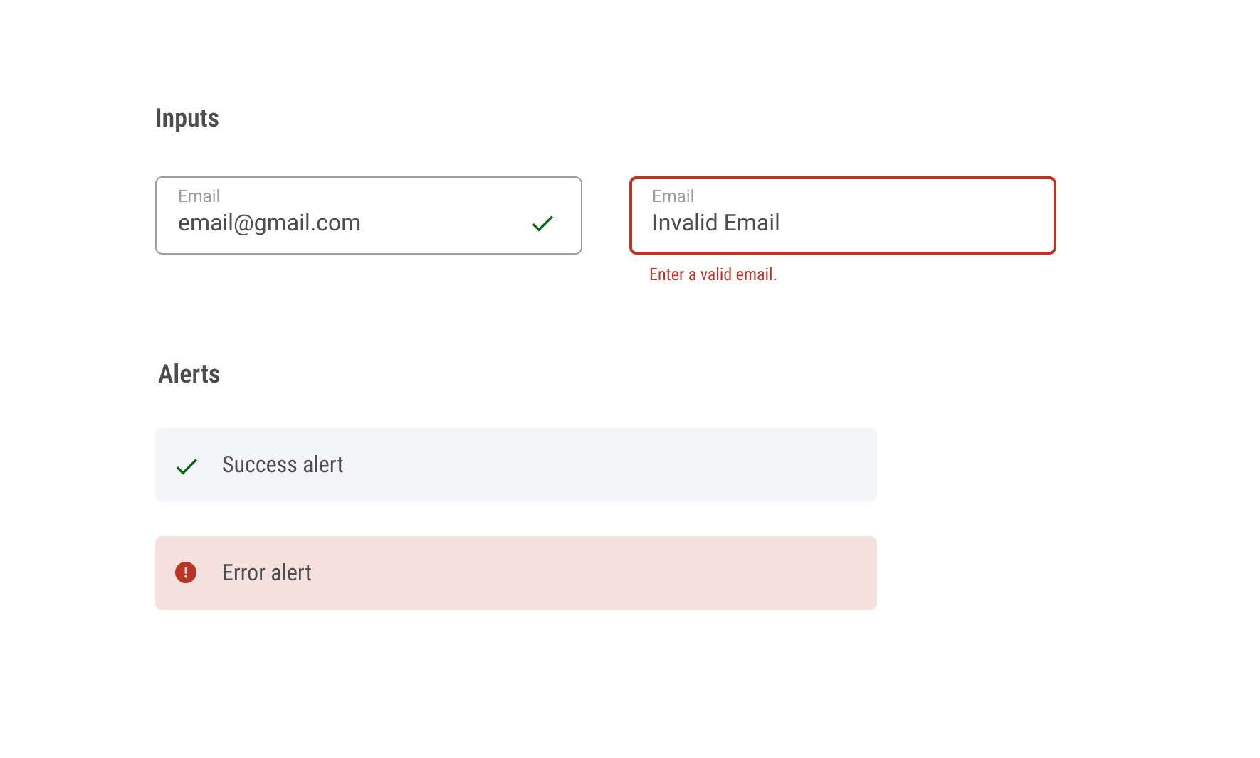
I collaborated with our branding graphic designer to integrate WCAG colors to on alerts, and to improve user accessibility across systems.
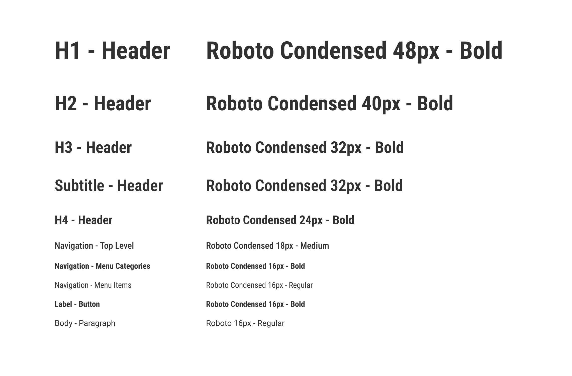
I expanded the typeface to multiple headers, a regular typeface for body copy, and standardized sizing.
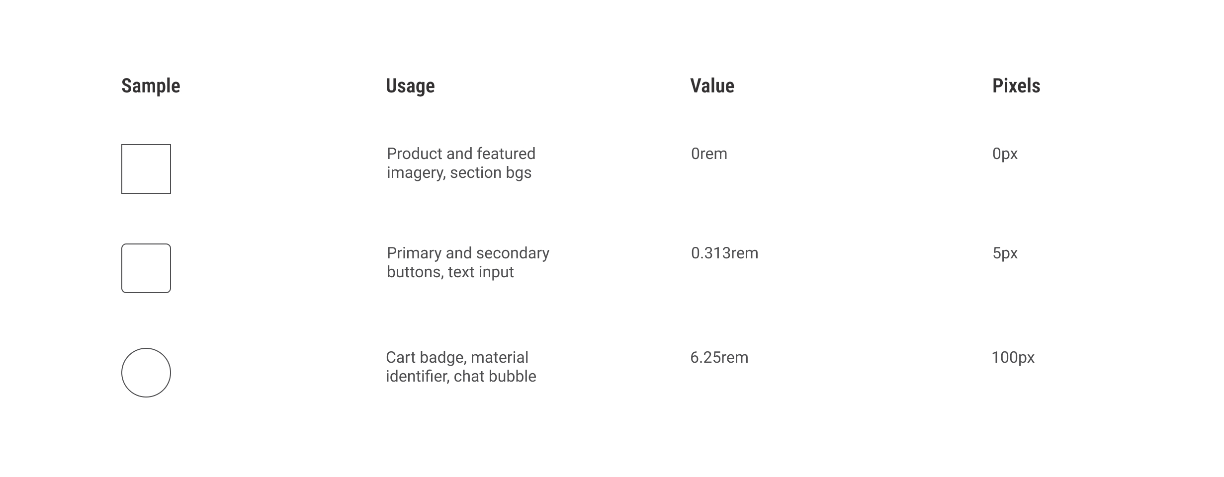
I established various shapes for elements. Rounded corners (5px) on CTAs feel more approachable and friendly, creating of sense of modernity and innovation in the experience.
Radius was added to increased usability through clarity and focus on shop and conversion interactions. For users with disabilities and physical limitations, it furthered the design to feel more comfortable and accessible.
Components
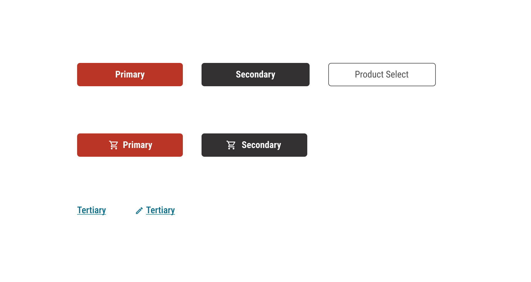
Sentence case, icons, corner radius, and a new tertiary color increased button usability and legibility for user actions.
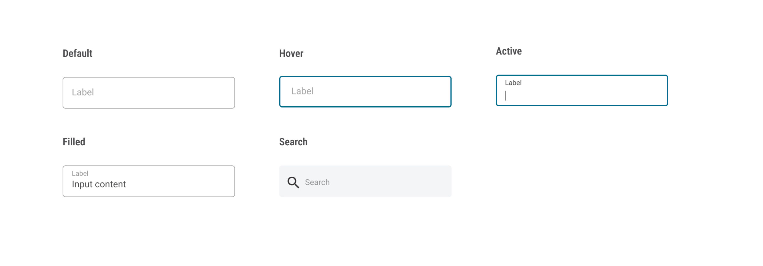
I identified input interactions in multiple states for text, fields, and search.
I collaborated with our branding graphic designer and front-end engineers to incorporate success and error states.
