CASE STUDY
This Week Mobile App
A better way to connect and inform.
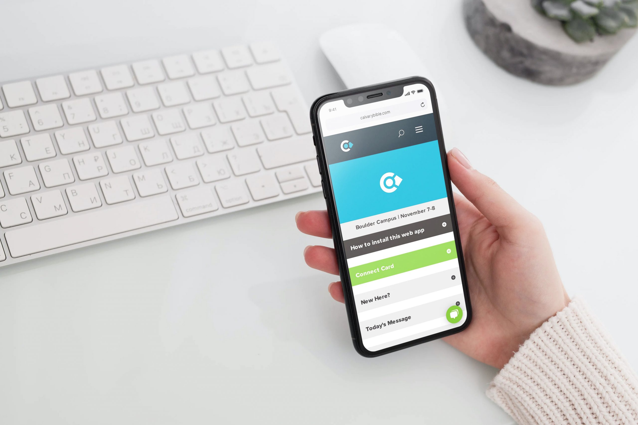
I designed, developed, and led a mobile web app launch for Calvary that replaced existing print materials, delivered information to members, and saved money each year.
Calvary is a multi-campus church in Northern Colorado offering both in-person and online weekend services. They believe people benefit from connecting in a small community, so they provide weekly groups for all ages of adults, as well as programs for kids and students.
Role
UX Strategy
UI Design
Mobile Development
Usability Testing
Goals
Replace the physical weekly handout and connect card with a dynamic mobile app to help people connect, engage, and register for events during the week.
A secondary goal was to reduce annual paper costs.
Challenges
Target Audience
Ideate
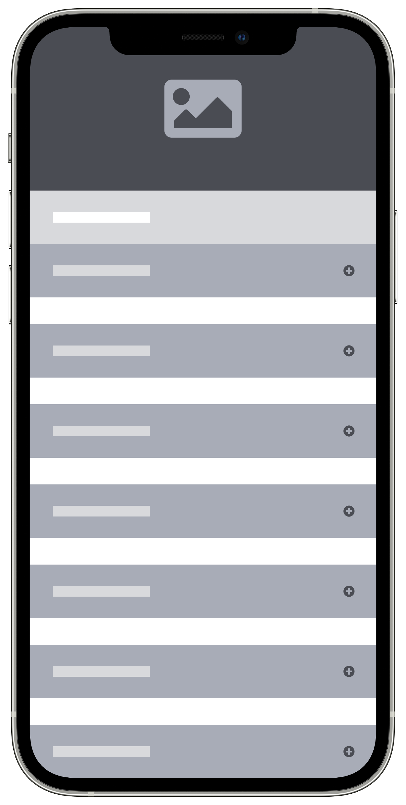
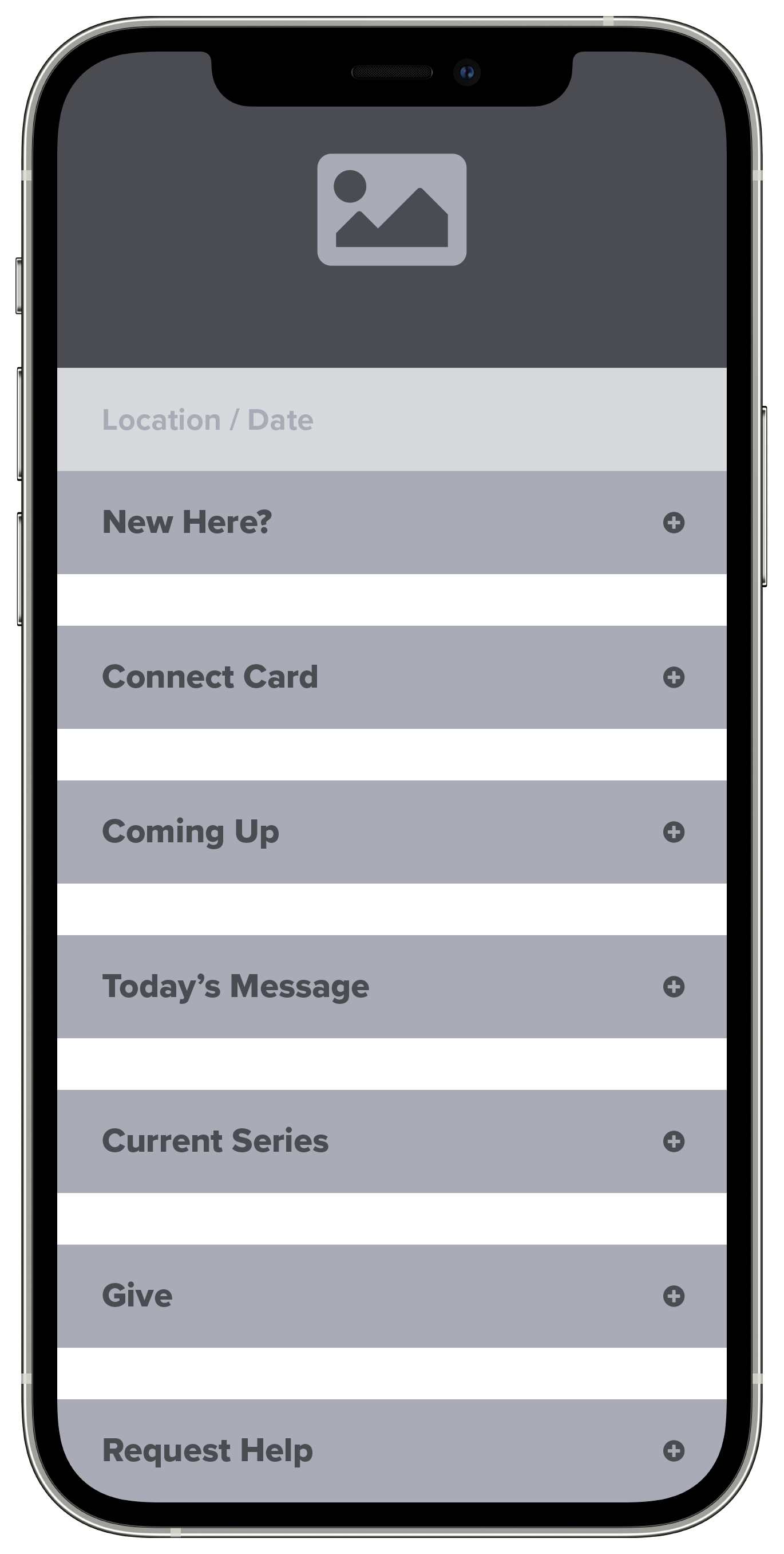
The first step in my design process was to empathize with the user of the physical, printed weekly handout that already existed. What was important to them? What were they looking for? Why did they take a handout or fill out a connect card in the first place? After reviewing all the content and sections in the handout I determined there were two main categories:
Content For User
Weekend Info (Services Times & Kids Programming)
General Organizational Info
Events & Announcements
Content From User
Connect Card
Receiving guest and updated info
Sign ups
Requests
Wireframes
Branding & UI Design

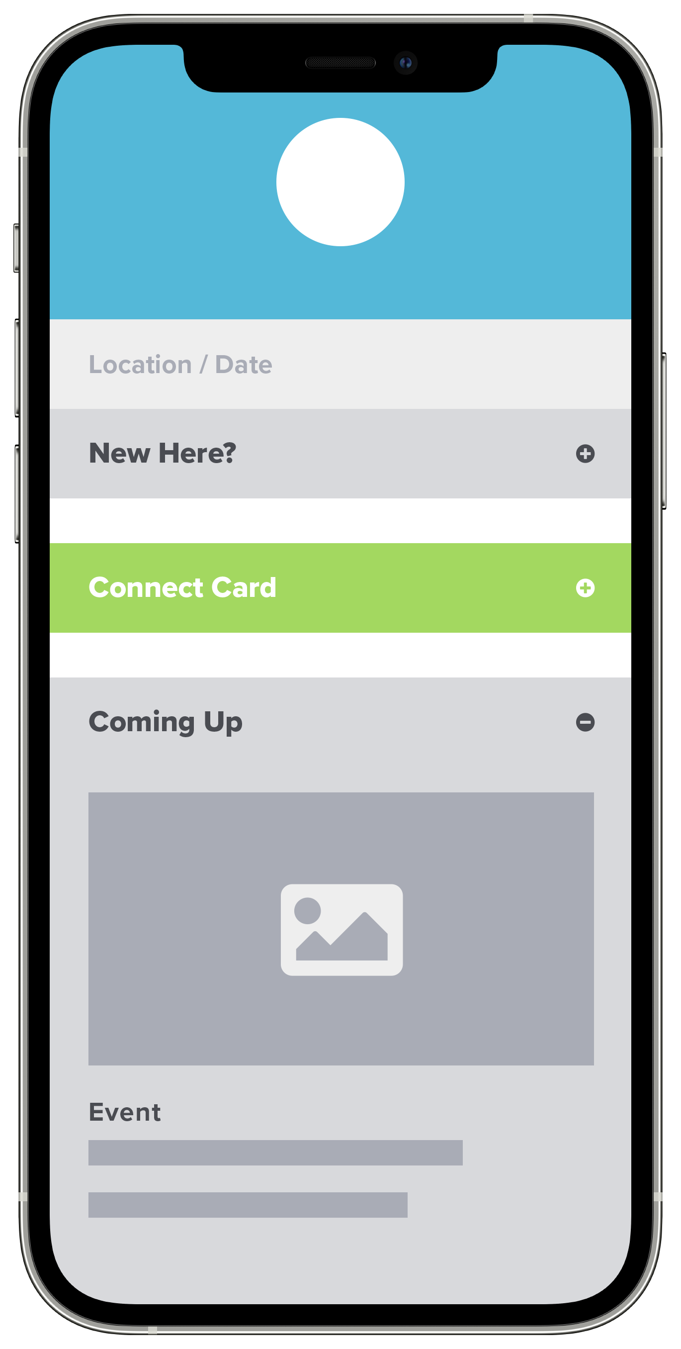
Prototypes
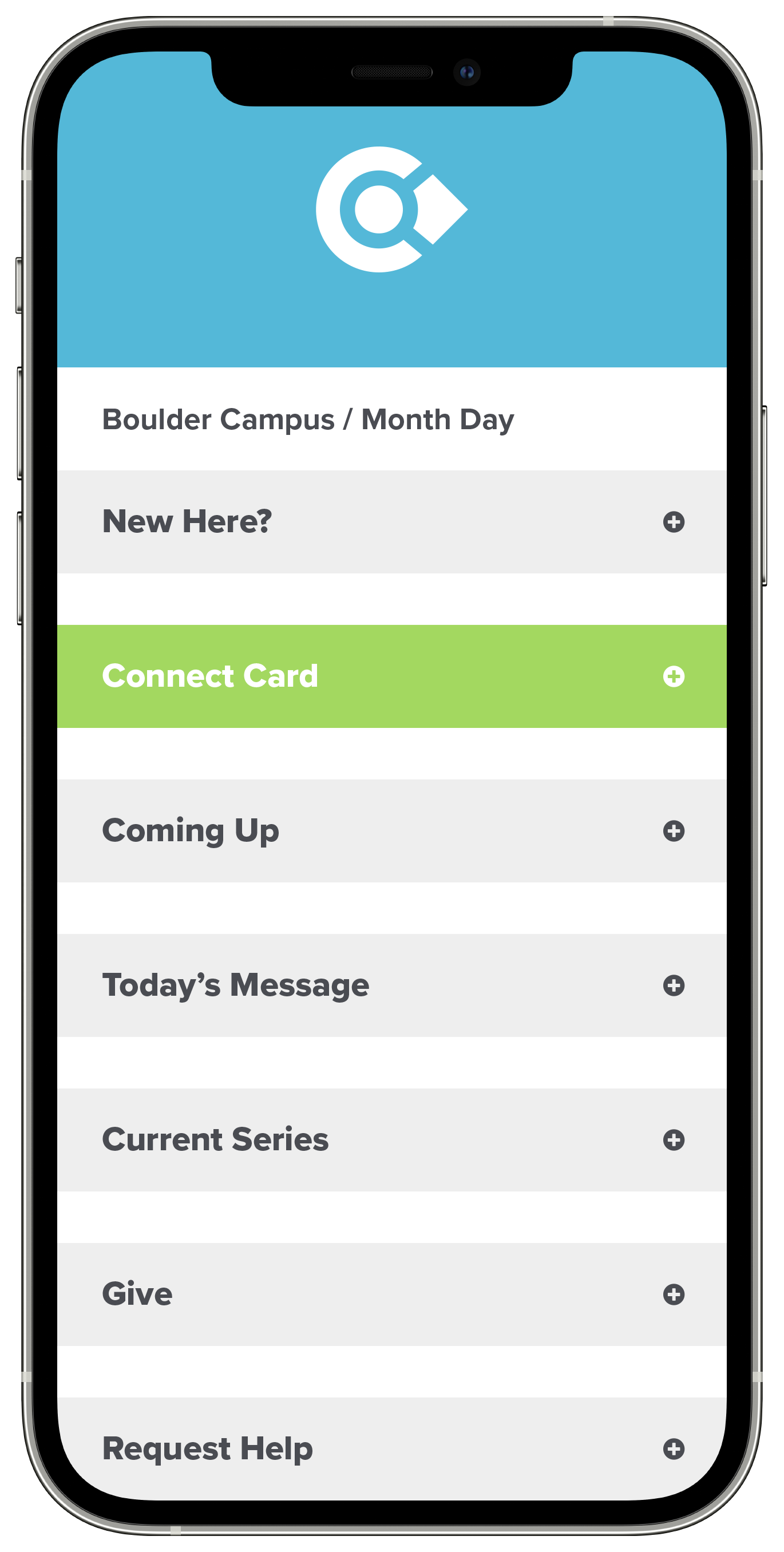
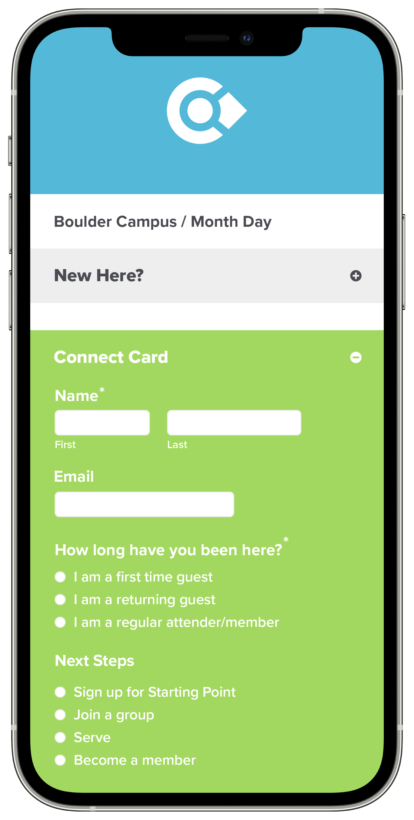
Usability Testing
60s female, organization member
Findings
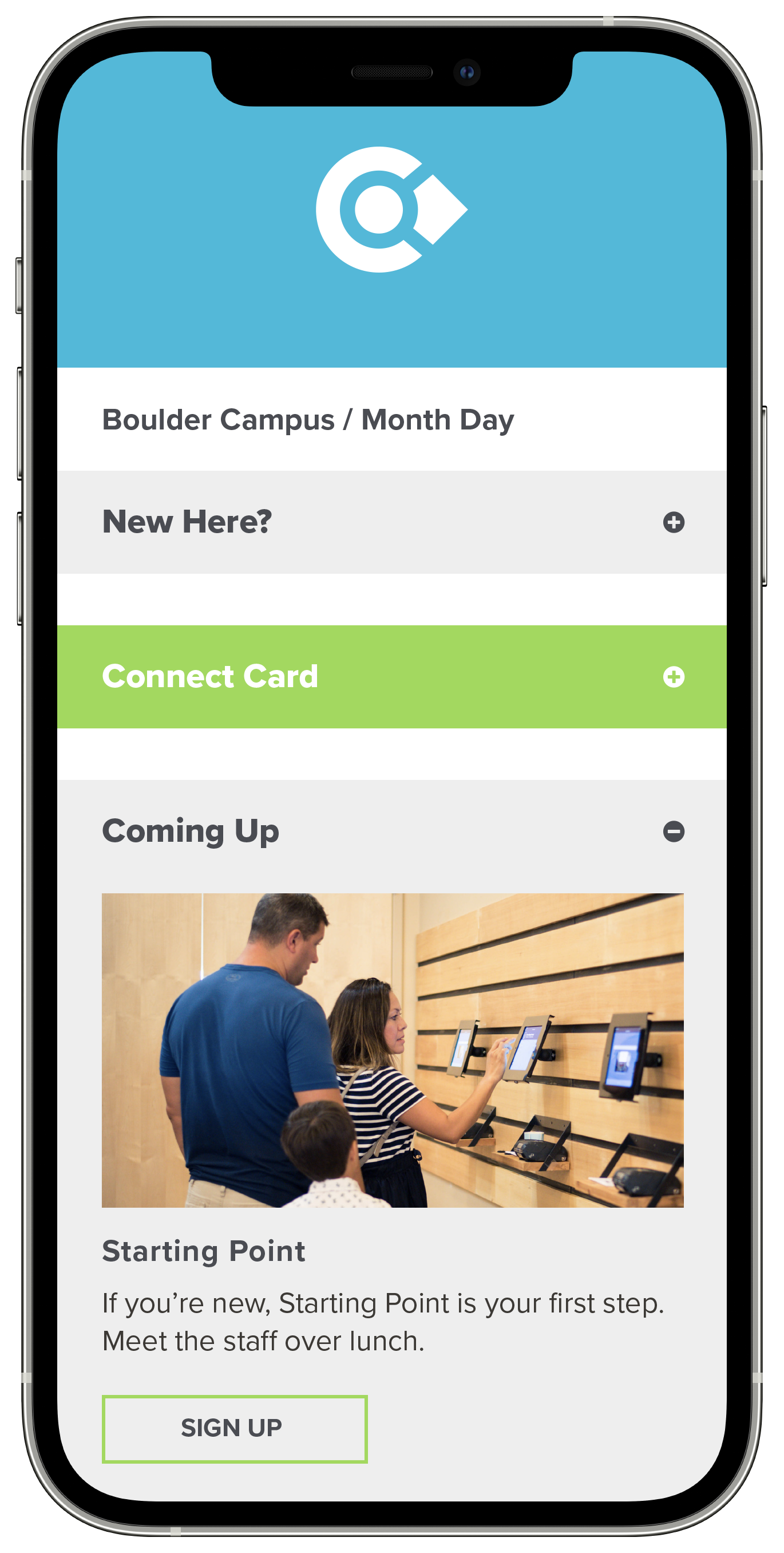
I learned that users are familiar with common actions on web applications, such as dropdowns. In my initial prototype, the dropdown background colors weren’t the same on open and close functions. In order to avoid usability errors and visual distraction, I changed them to be a consistent color. The findings also showed that some animation adjustments needed to be made.
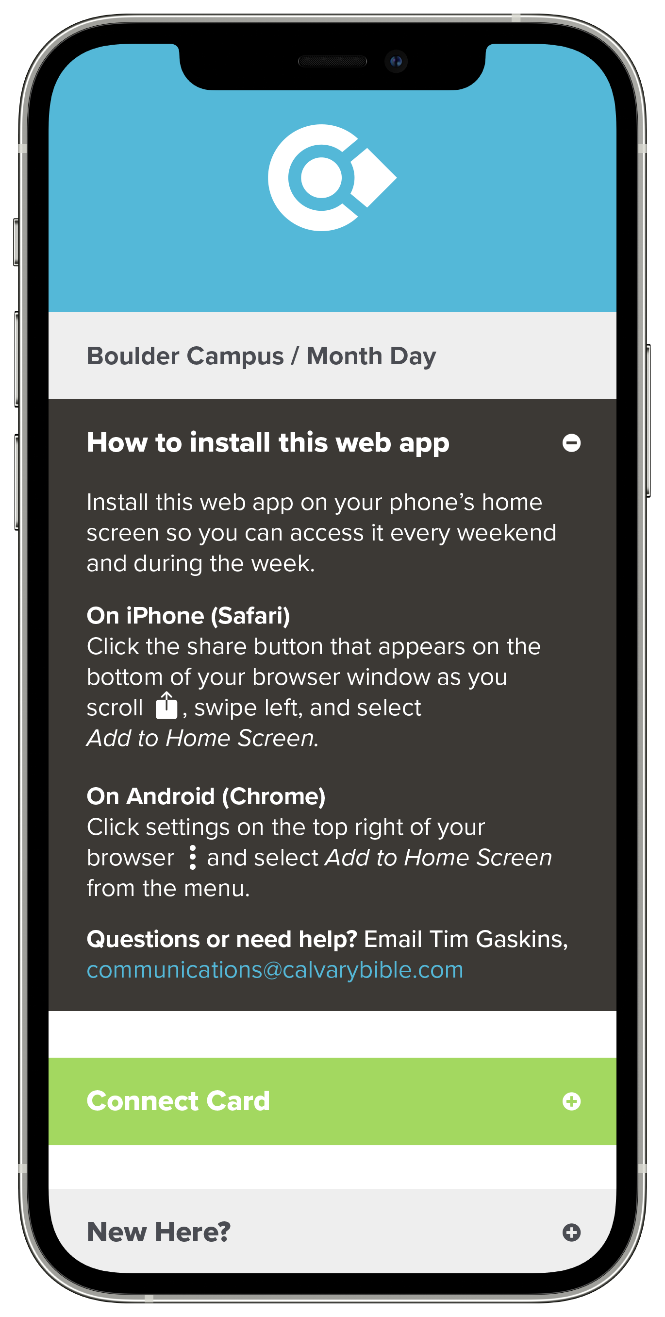
Another key finding was that users had varying familiarity with the “Save To Home Screen” browser function. Although this feature was not necessary to use the web app, I believed that having users add the mobile app to their home screen as their first action could increase weekly returns. To address this, I added a dropdown with install instructions, accounting for iPhone and Android users.
Results
200
weekly users
493
connect forms each year
$1,144
paper & print savings each year
