CASE STUDY
One-Page Checkout
Reducing cognitive load to increase conversion.
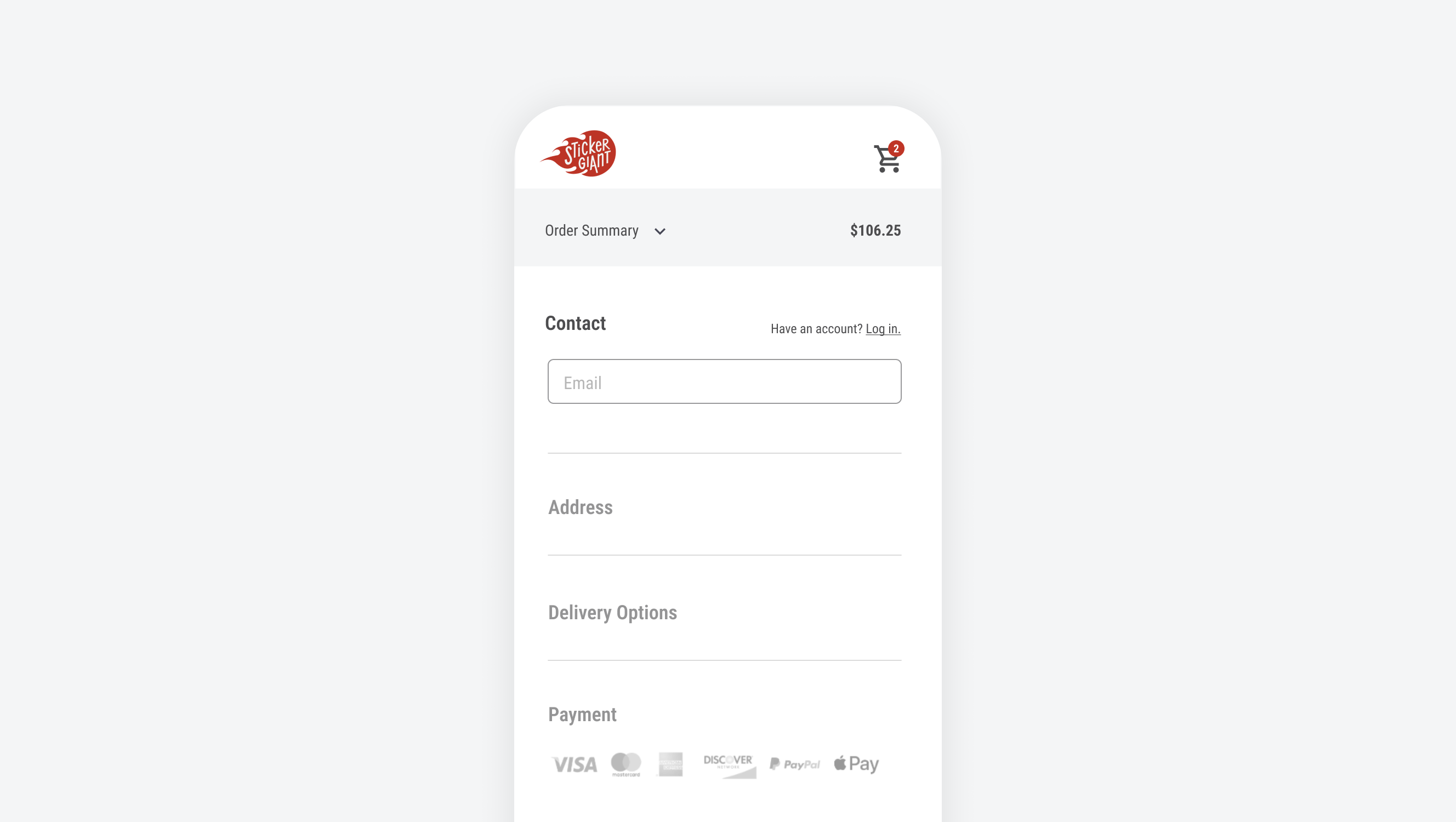
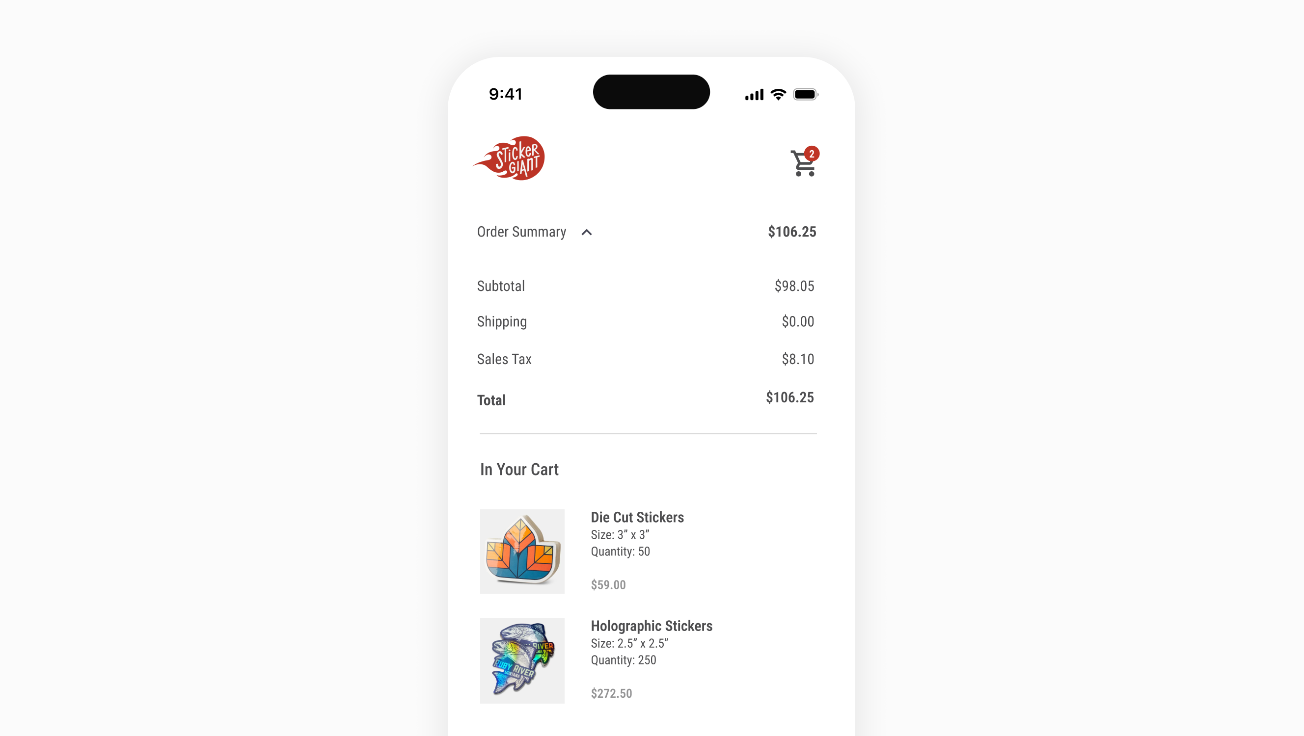
StickerGiant’s existing checkout was based on a theme but wasn’t designed for our products or experience. This was a project with a rapid timeline to go live where I collaborated with our front-end engineers on design, scope, and features in a UX agile process throughout development.
Role
UX Design
Responsibilities
Strategic Vision
Discovery/Competitive Analysis
Wireframes & Prototypes
Design Reviews
Timeframe
JAN – FEB 2024
Problem
Challenge
Discovery
Delivery and Shipping Speed
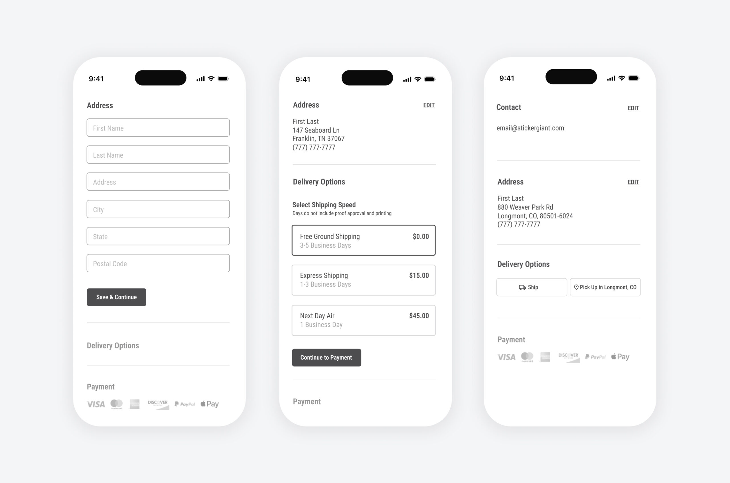
Our cross-functional team assumed that the percentage of local pickup orders was under 2% due to orders placed throughout North America. In reality, the percentage was closer to 10% because of our strong local presence and speed without shipping.
Instead of primarily showing pickup for all customers or hiding it as a secondary option, we built conditional logic into the flow from the address to personalize checkout. If an address was local, pickup would display as an additional option. A learning here was to make data-driven decisions to help solve a problem or inform the interaction of a feature.
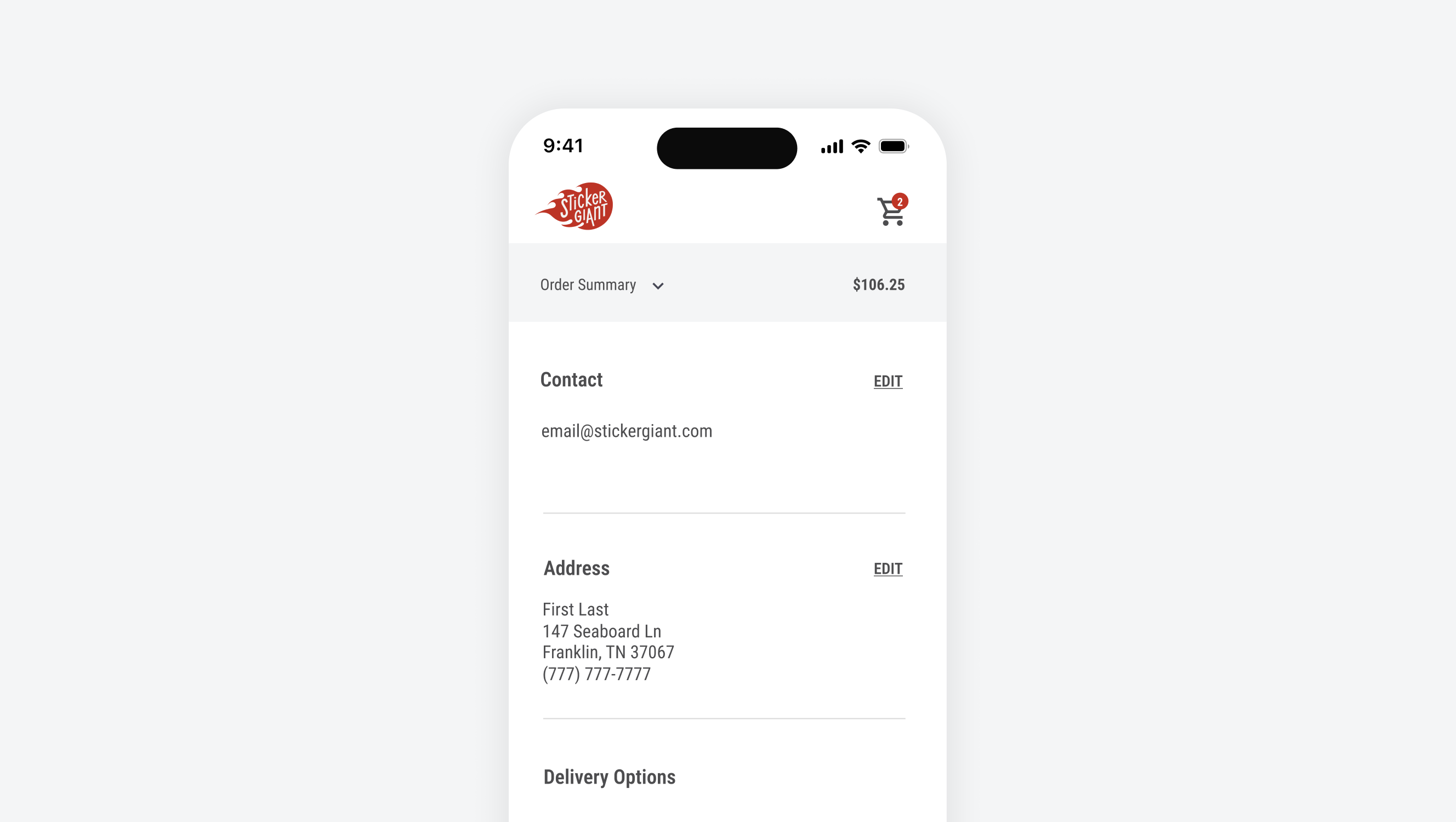
Previous experience showed the carrier (UPS, Fedex, USPS) but it was confusing and caused too much cognitive load. We knew that the customer was only concerned with speed and price, so as a solution we opted to remove the carrier and show simplified, useful information only.
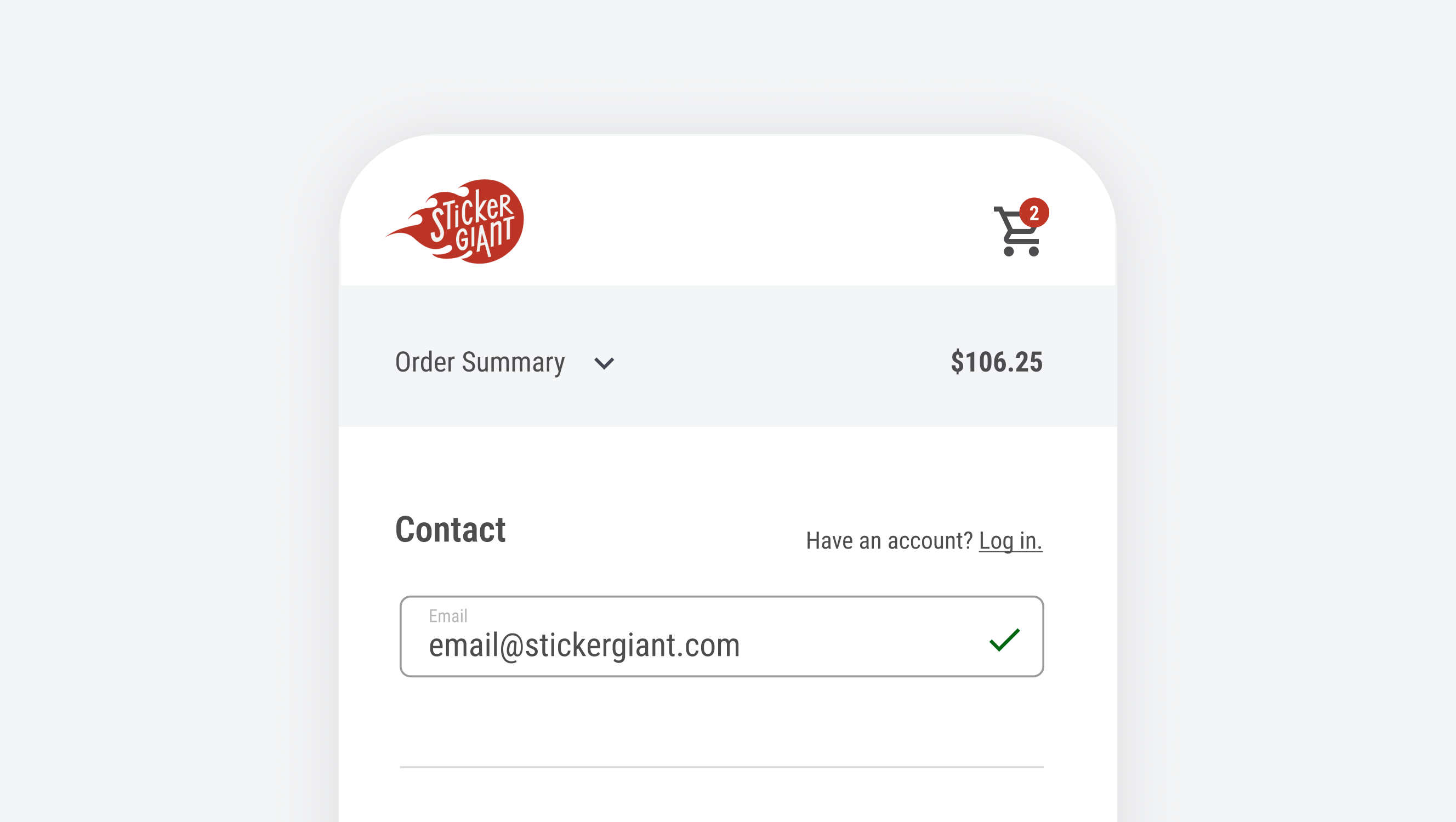
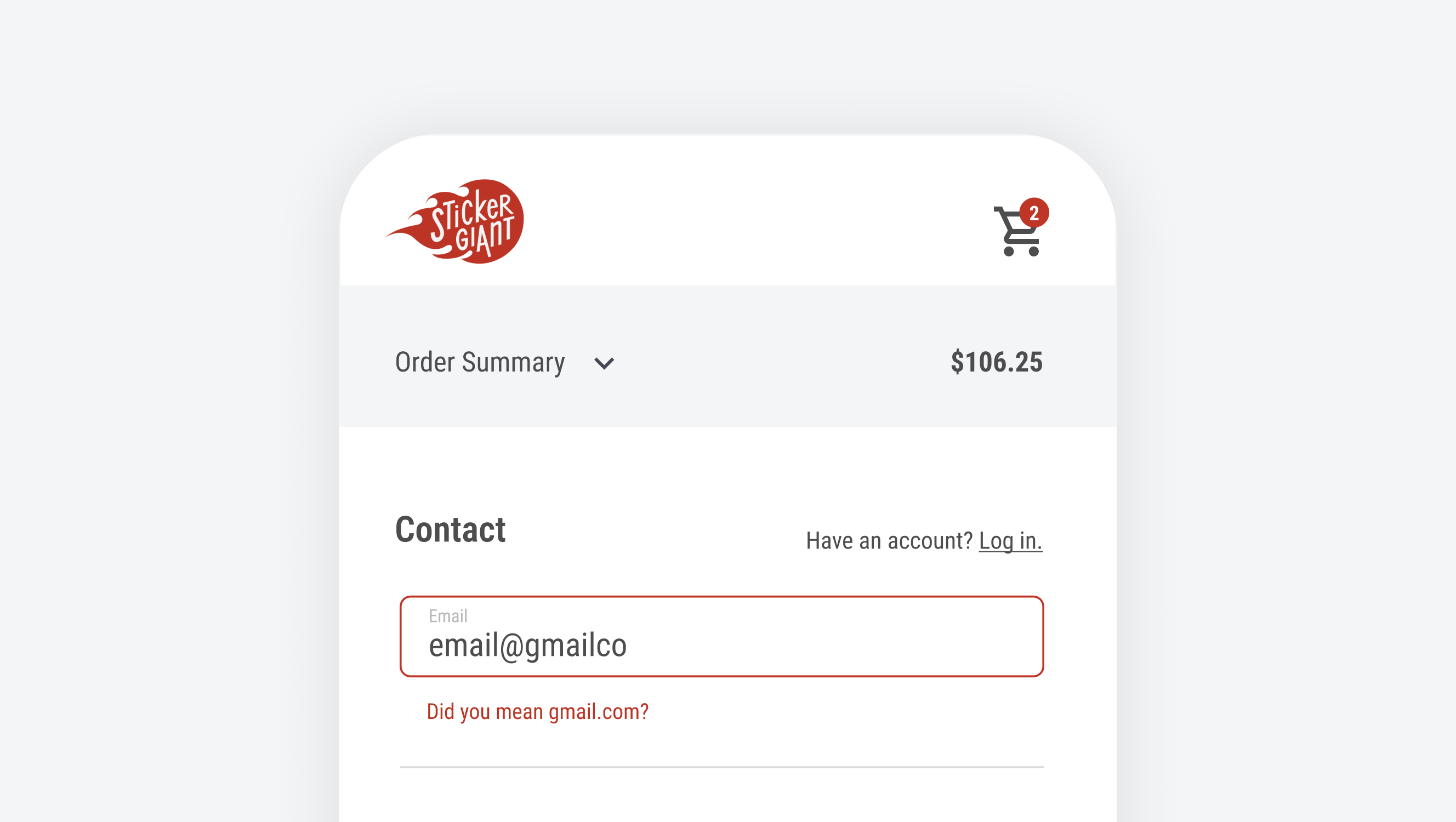
Feedback for the user at the most sensitive points in the journey.
Improving Accessibility
I collaborated with our design shop to identify WCAG interaction colors to incoporate with our refreshed brand for copy, success, error states, and CTAs.
- WCAG brand colors
- Hyperlinks underlined
- Rounded corners on buttons and form fields
- Increased font size
- Contrast checkers
Impact
Results
35%
decrease in cognitive load
23%
increase in confirmation dialogs
54%
decrease in page load times
