CASE STUDY

Guest Web Experience

A strategy and experience pathway for guests.

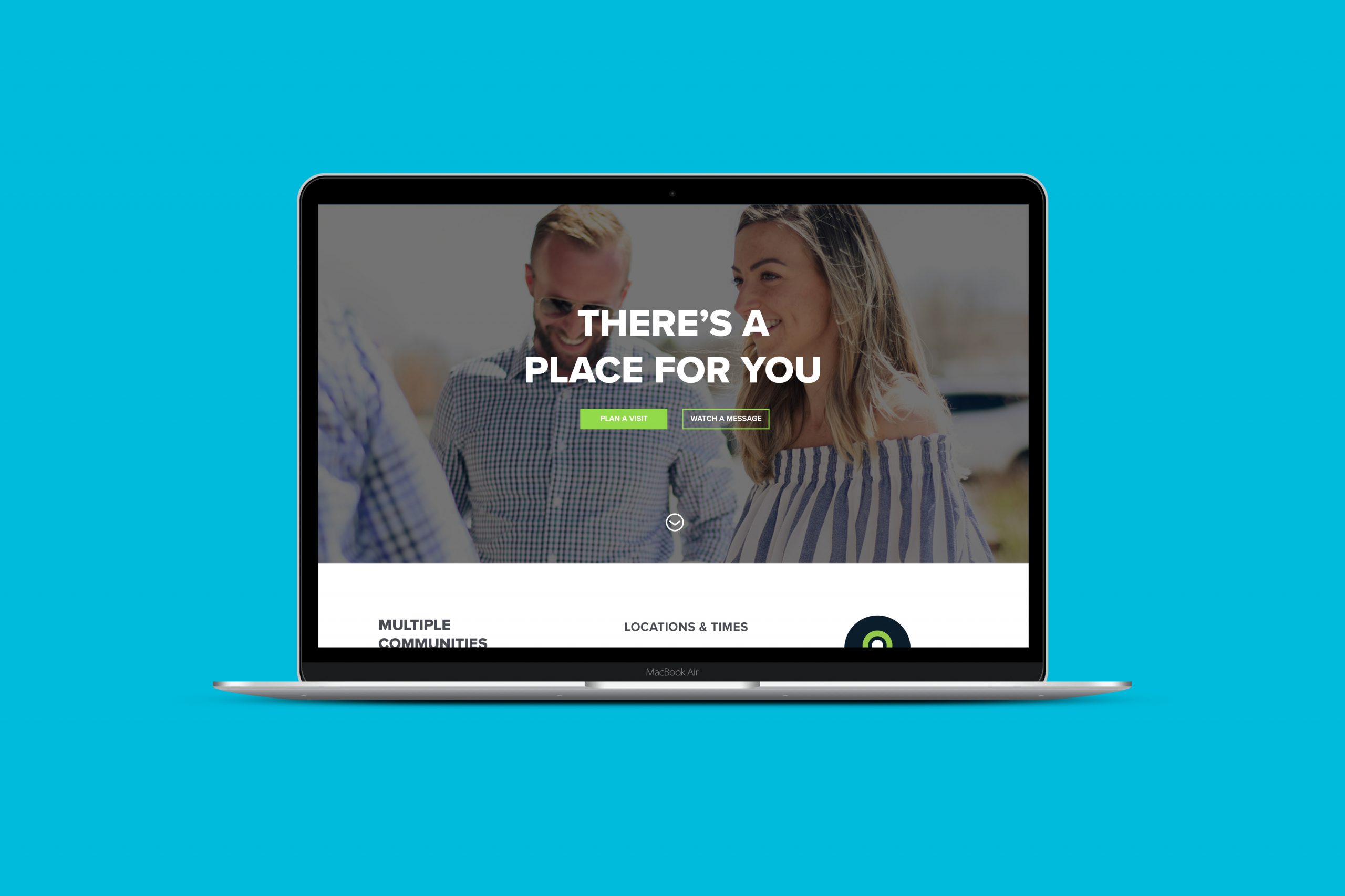
I researched, designed, and created the guest web experience for Calvary, a multi-campus church with locations in Boulder, Erie, and Thornton, Colorado. Each weekend, more than 1,600 people attend in person or watch online. They believe people benefit from connecting in community, so they offer weekly groups for all ages of adults and programs for families.

During my time as the digital communications director, the organization expanded to a third physical location, created a weekend online community, and rebranded. I designed, developed, and launched a new website.

Role

UX Strategy
UI Design
Usability Testing
Web Development

Goals

Lower barriers for guests to connect with the community, become members, and start partnering with the organization.

On the website homepage, create a digital front door experience for the local campus communities, and put relationships and people over event programming.

Challenges

Prioritize messaging for new guests, while keeping resources for current members easily accessible.

Although secondary, resources for returning guests needed to be included in the design of the navigational system.

Target Audience

Our team created a user persona to reflect the organizational target audience of young families in their 30s and 40s who resonate with spirituality.

First-time guest users are the primary priority, returning users secondary.

Ideate

To address the goal and problem of lowering barriers to guests’ next steps, I created an information architecture strategy to guide navigation and homepage hierarchy. The question I addressed was “How do I use the website experience to move people from guests to fully committed members of the organization?”
Each navigation dropdown along the pathway prioritizes the guest while providing key information for members. Beginning with About, the user learns about the organization, then finds locations, times, and basic campus information in Plan A Visit. The user then previews music and messages prior to a visit in Watch, then finds a group or program in Connect, registers for Events, and finally financially partners with the organization to Give as a committed member.

Wireframes

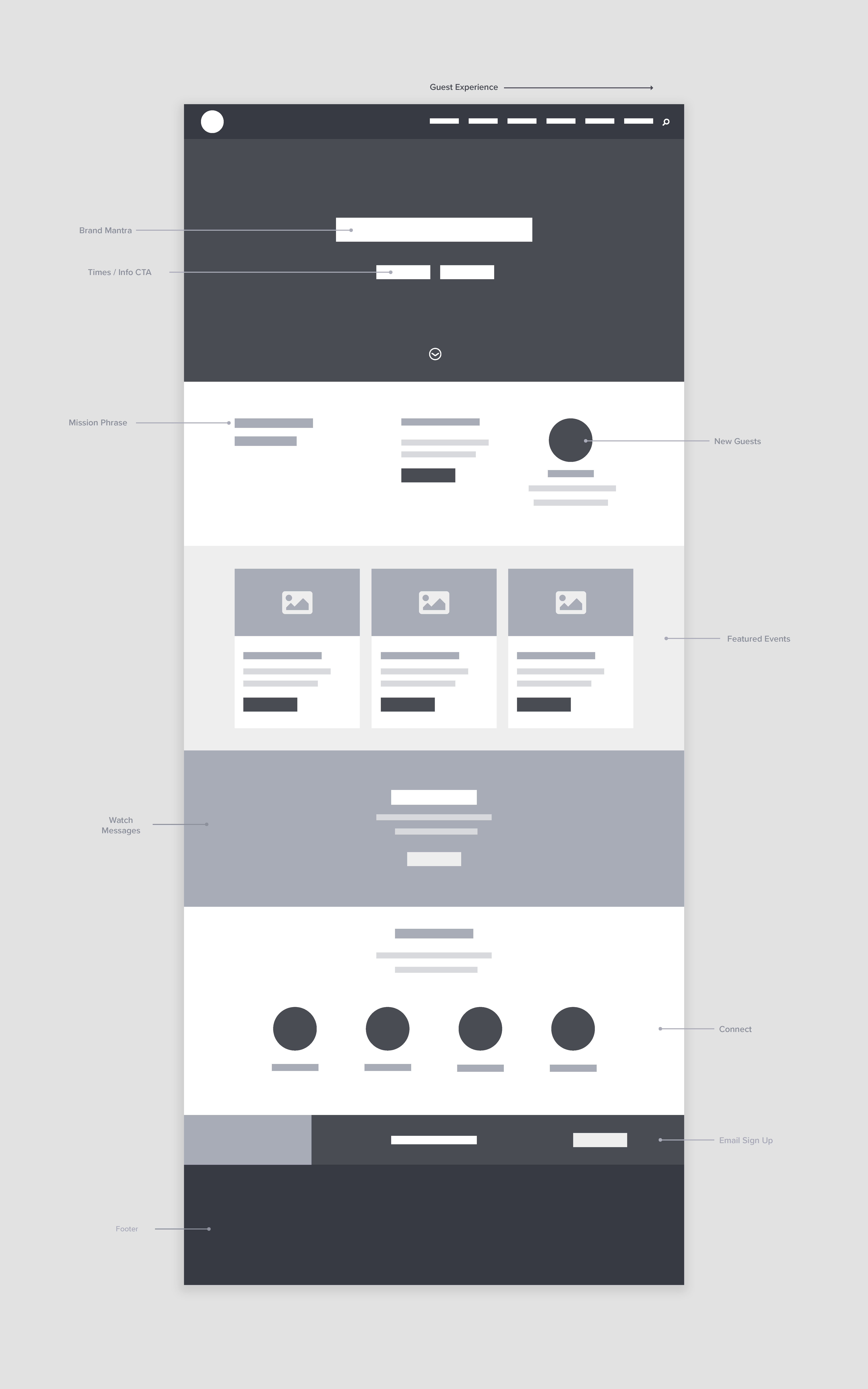
I created an initial wireframe to explore homepage hierarchy, visual sections, and key call-to-actions with the goal to take users on a journey to learn more, plan a visit, and ultimately connect with the organization.
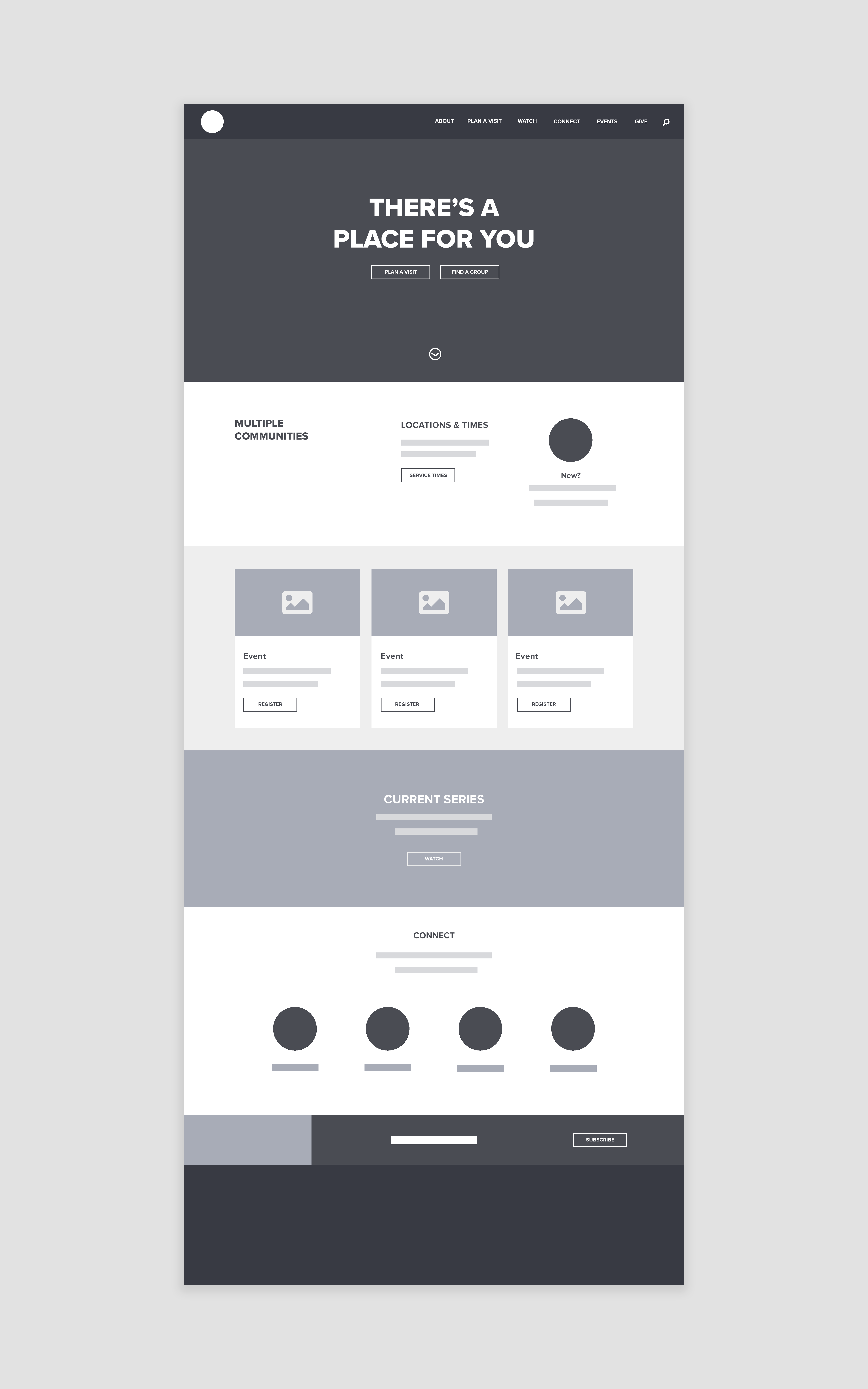
The next step in my design process was to add a messaging strategy to the initial wireframe. The key mantra that I used was “There’s a place for you” in order to lower the barriers for guests to connect. The strategy behind this simple phrase was to resonate with various users and organizational commitment levels–from first-time guests to those interested in membership and giving.

Branding and UI Design

I was a key member of Calvary’s creative branding team that partnered with Historic, a design agency based in Phoenix, AZ. The logomark that we landed on with their graphic designer is made up of three core elements– a C representing Calvary, an inner circle representing our vision, and an arrow to represent our members going out into the community.
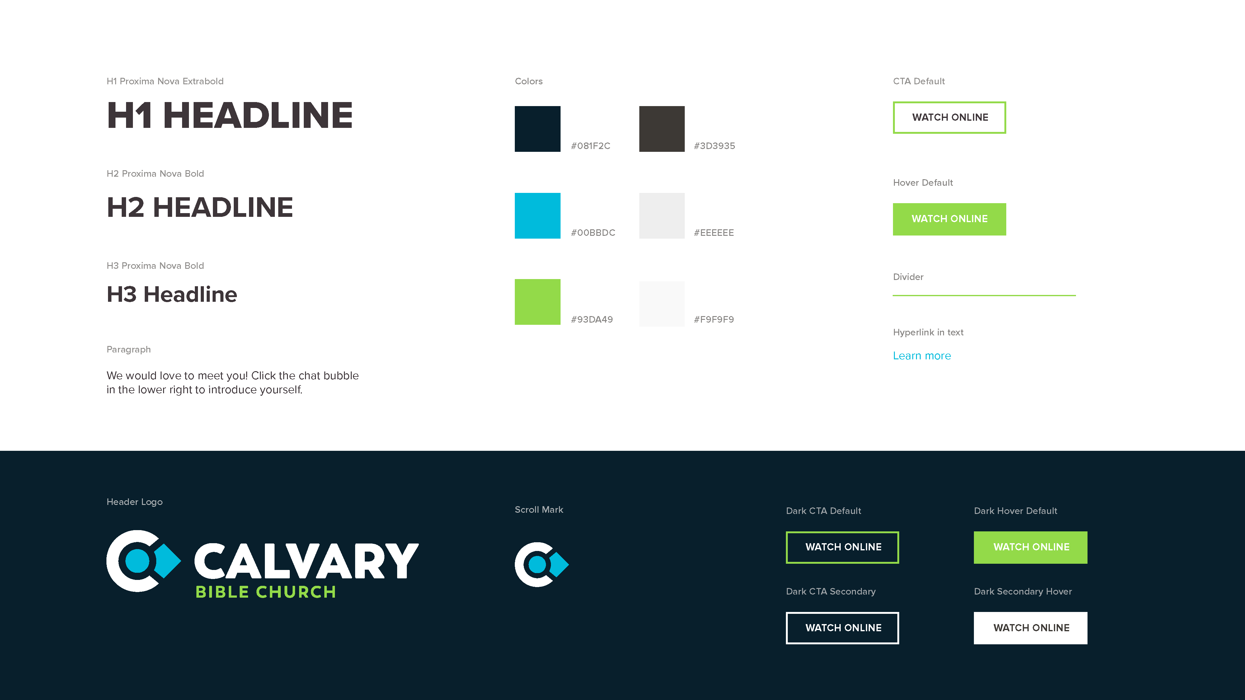
Using the logomark and visual identity delivered to us by Historic, I created a web style guide to inform visuals and establish Calvary’s brand online.
One of the hidden messages in the logomark is that when rotated, a map pin and person appear. Using elements in Calvary’s logomark and visual identity, I designed icons for guest connection and next steps. Each icon includes a highlighted color to emphasize the map pin, person, arrow, or C.
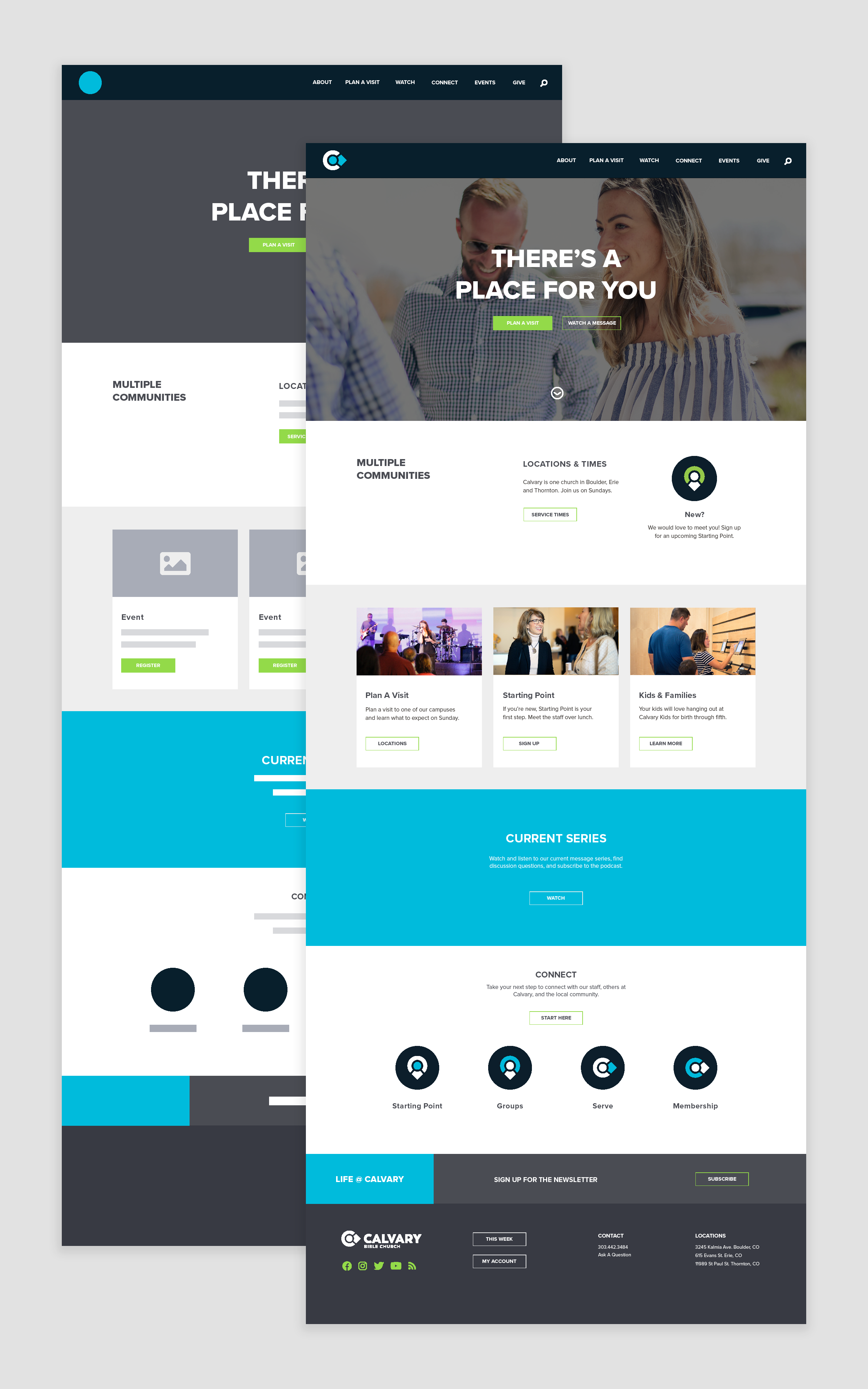
Using the web style guide, I added the logo, brand colors, and icons on the messaging wireframe to direct the user flow to key call-to-actions. I developed a prototype for testing using images that captured the weekend experience. For these key visuals, I focused on images of people in the target audience throughout various stages of the weekend experience–exterior, lobby, kids check-in, and music in the service.

Usability Testing

I held field studies on Zoom with recorded click-throughs on the final beta prototype. I selected three test users that represented the spectrum of the target audience.
40s married male, family with two kids, marketing and communications expert
30s married female, research scientist, starting a family

20s single male, financial entrepreneur

Scenario

I gave each test user the same scenario in order to determine if they could figure out how to plan a visit and recorded the path they took to complete the action:

“You are looking to find a church in Boulder and navigated to calvarybible.com through a search engine. Your objective is to plan a visit to the Boulder campus.”

Findings

Each test subject took a different path to find specific times for the Boulder campus, from scrolling on the homepage, learning more about our organization on the About page, to clicking Plan a Visit on the main navigation. People use websites in different ways. I discovered that I can’t assume each user will take the same path to find information. This influenced many of the call-to-actions throughout the Calvary web experience to make sure the goal for guests to connect was as easy as possible on scrolls, navigation content, and the site footer.
My main finding from these test users and the design of the guest experience is reflected in Postel’s Law which states:
Be empathetic, flexible, and tolerant to any number of actions the user could possibly take.
One user assumed that an event card call-to-action button labeled Sign Up would immediately take them to a registration form, instead of an event page with details. Based on this key finding, I updated many buttons to the format, Learn More + Sign Up in order to lower barriers and increase clicks.

Results

58%

increase in monthly users

29%

decrease in monthly bounce rate

100

guest online sign ups / year
Visual Grid Design