CASE STUDY

E-Commerce Design

A design strategy based on UX principles, psychology, and user research.

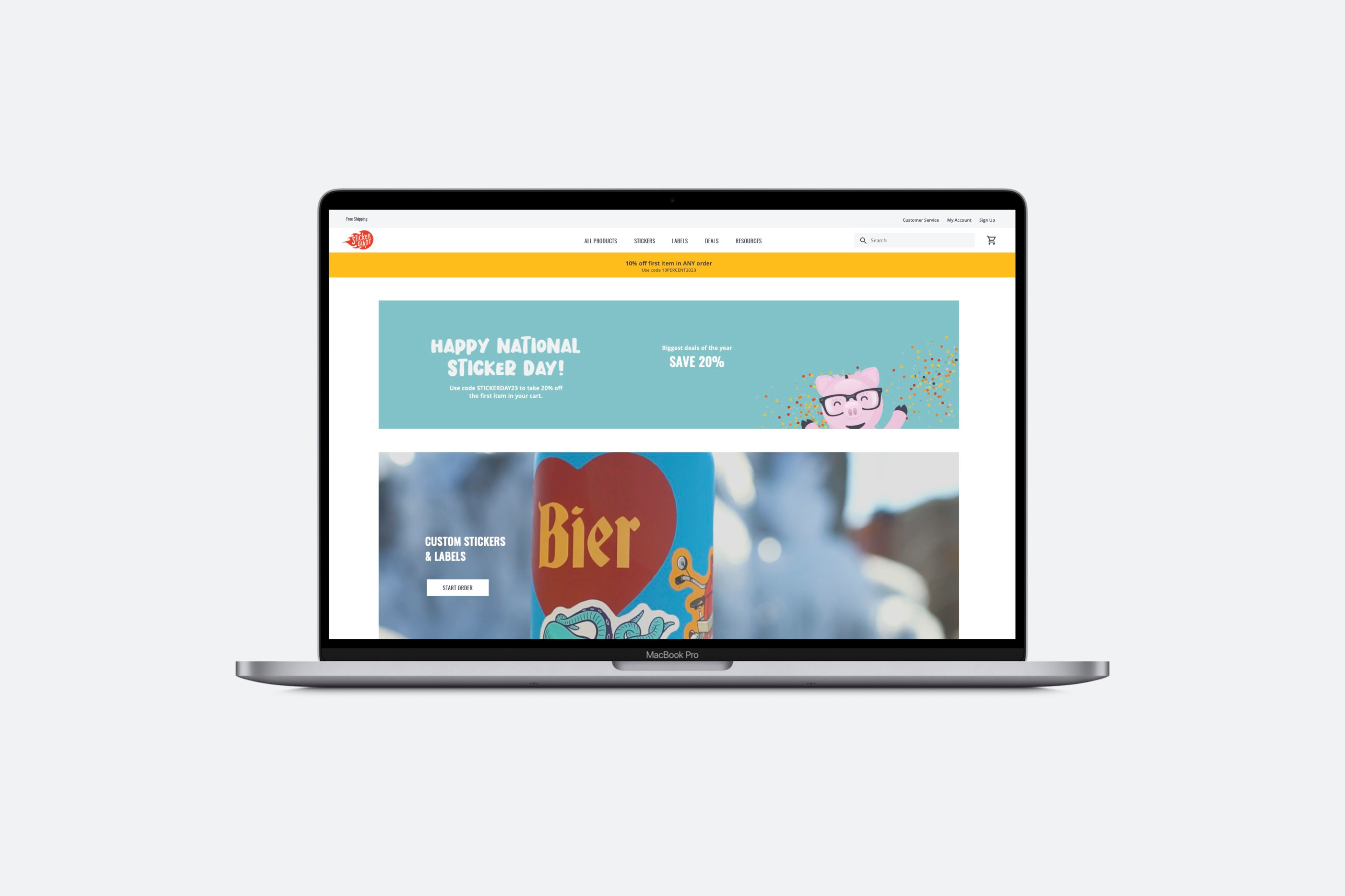
I led the design strategy for a new website based on e-commerce trends and UX best practices for StickerGiant, one of the top custom sticker and label brands online. When I joined the company, they had just been acquired and were in position to transform from a small custom printing business to an e-commerce tech company. I was in a unique role that bridged the gaps between software development, product, and our go-to-market teams.

Role

UX Design Lead

Responsibilities

Strategic Vision
User Research
Wireframes & Prototypes
Competitive Analysis

Timeframe

NOV 2022 – JULY 2023

Problem

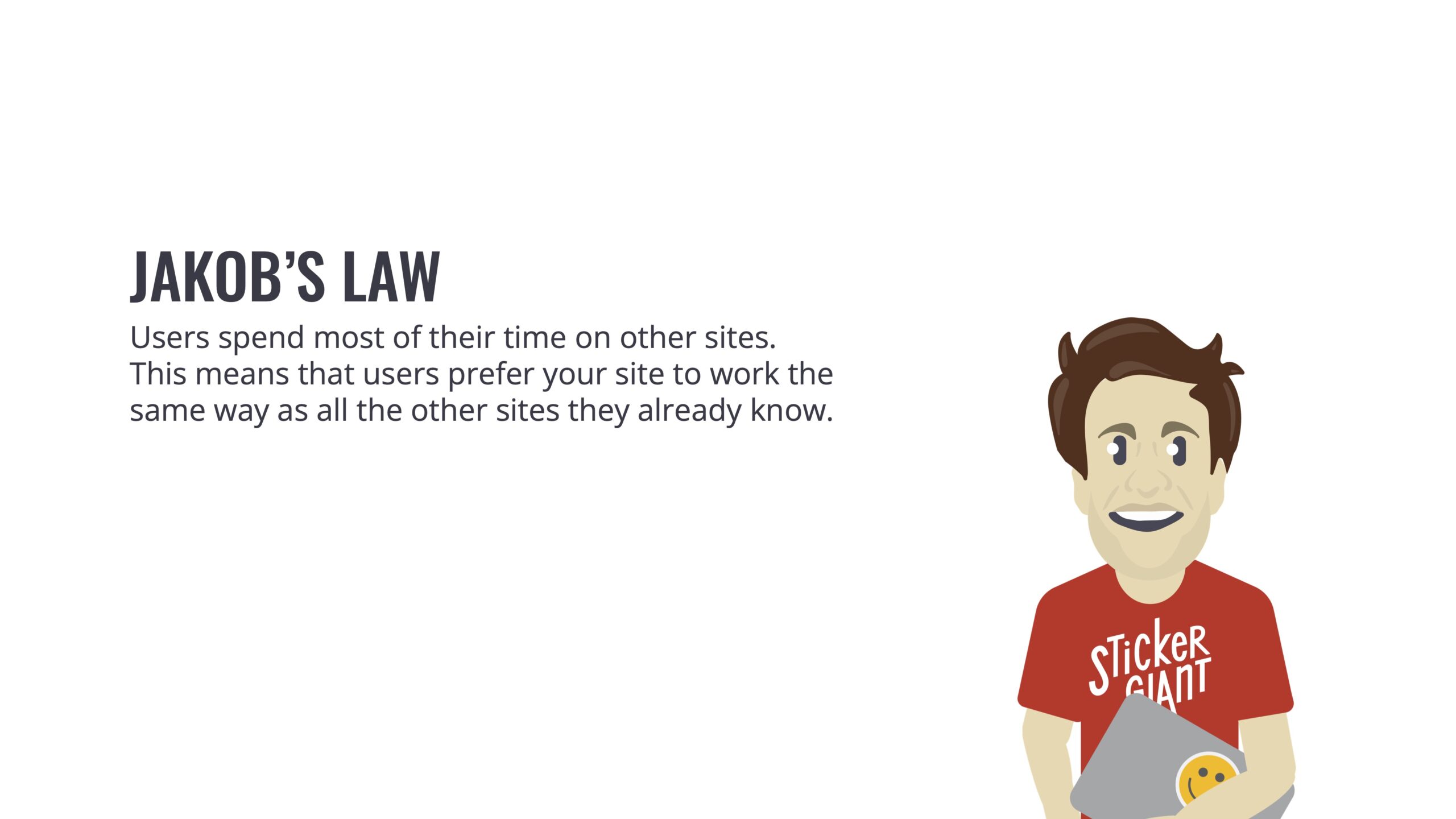
The existing website had run its course over seven years to maintain revenue numbers, but wasn’t positioned to enable StickerGiant to convert new customers and grow into an e-commerce technology company. The site didn’t work the same way as an e-commerce site that followed standard UX and product display patterns. This caused frustration and an experience that had to be learned by users.  A strategy that followed UX best practices and e-commerce trends was needed to convert new customers and beat top competitors.

Challenge

How might we design an e-commerce site that is easy to use and lowers barriers for users ordering stickers and labels?

A Familiar Shopping Experience

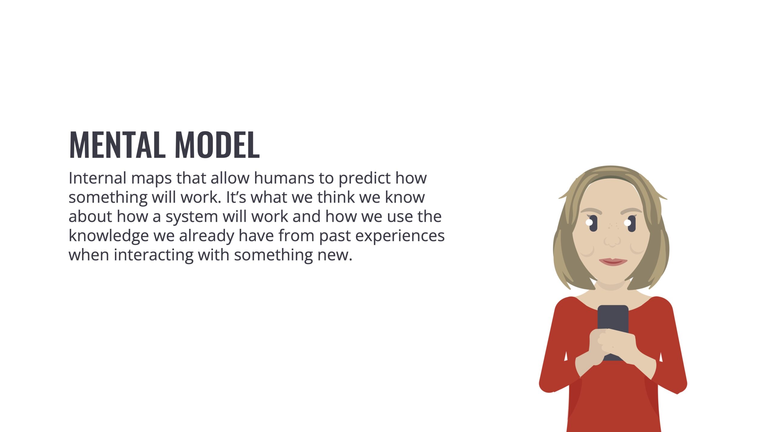
Users are used to familiar e-commerce experiences and subconsciously predict how something will work. I knew that we had to use a similar structure to top shopping experiences for the new site UX to engage customers to quickly help them navigate to our products.

Research

What are e-commerce best practices and trends? Are there patterns to follow to improve the user experience?

I did a competitive website experience analysis between StickerGiant’s top direct and indirect competitors, as well as big shopping brands in order to understand the mental models of our existing and future customer base.

I identified key UX elements in strategy and structure across these e-commerce sites that were missing from the existing StickerGiant website.

Design

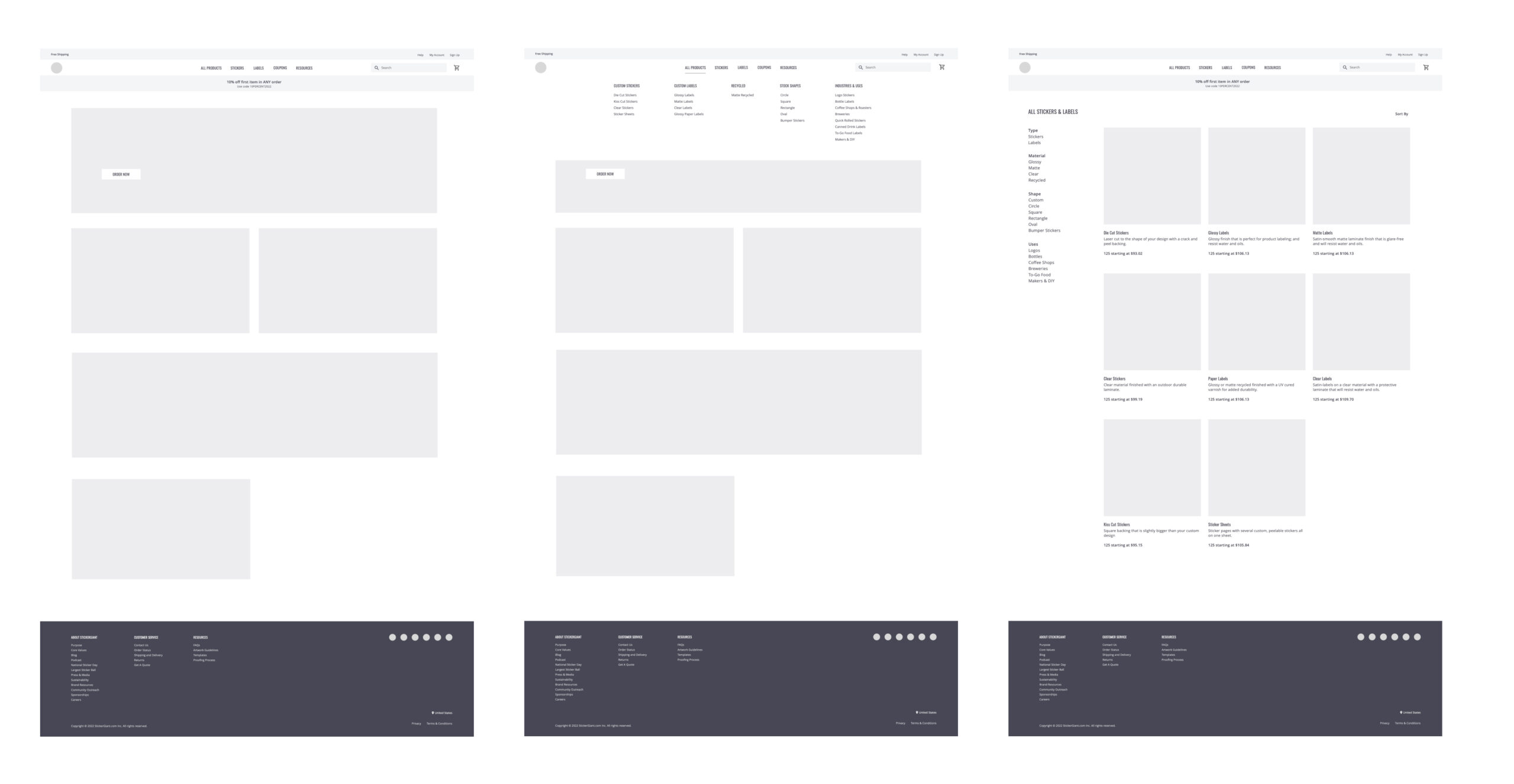
Based on the research, E-commerce UX elements that were missing from the previous site informed the new design IA, layout, visuals, and copy. Initial wireframes focused on the customer mental model of how they expected a shopping site to work.

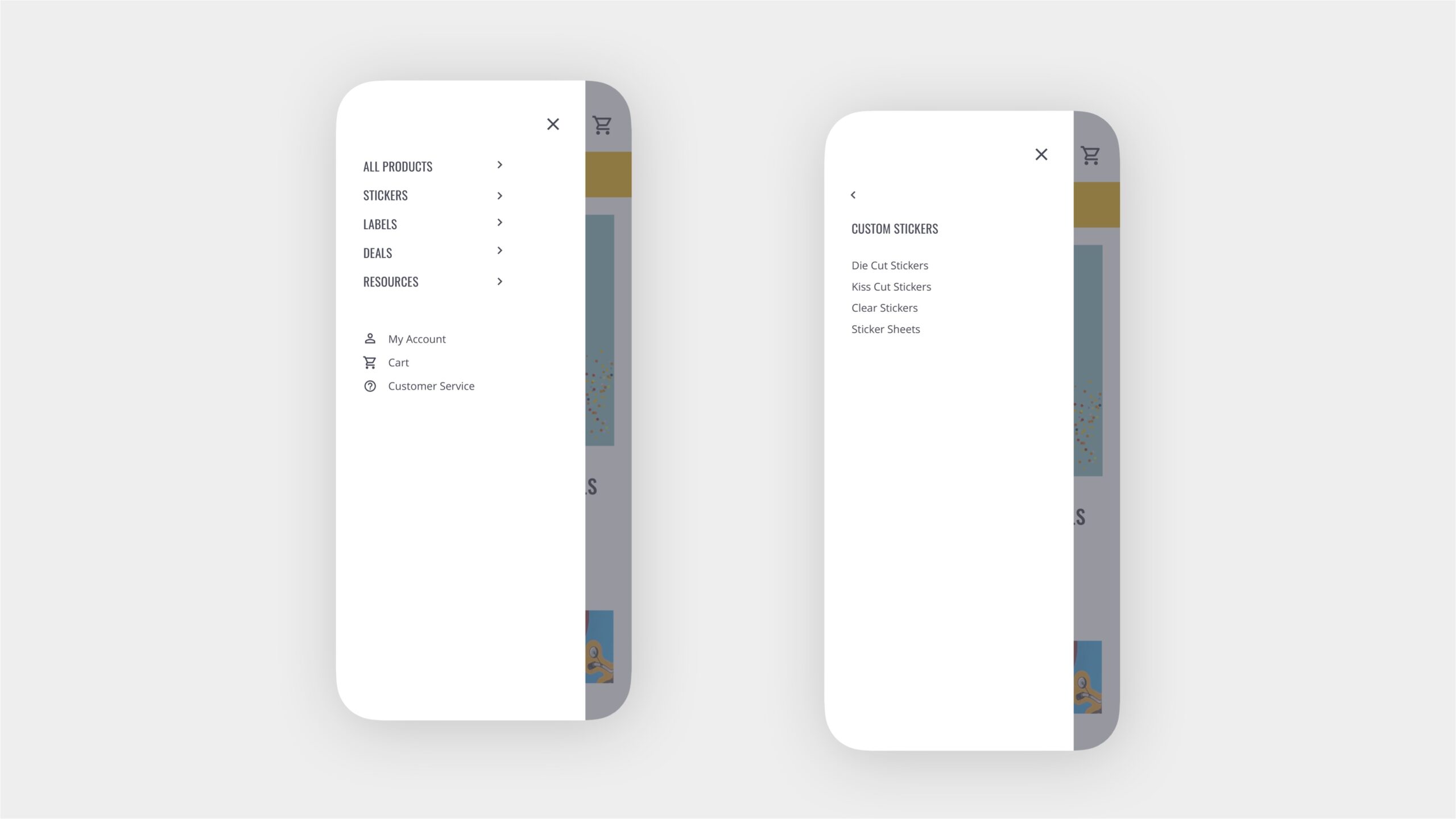
Navigation

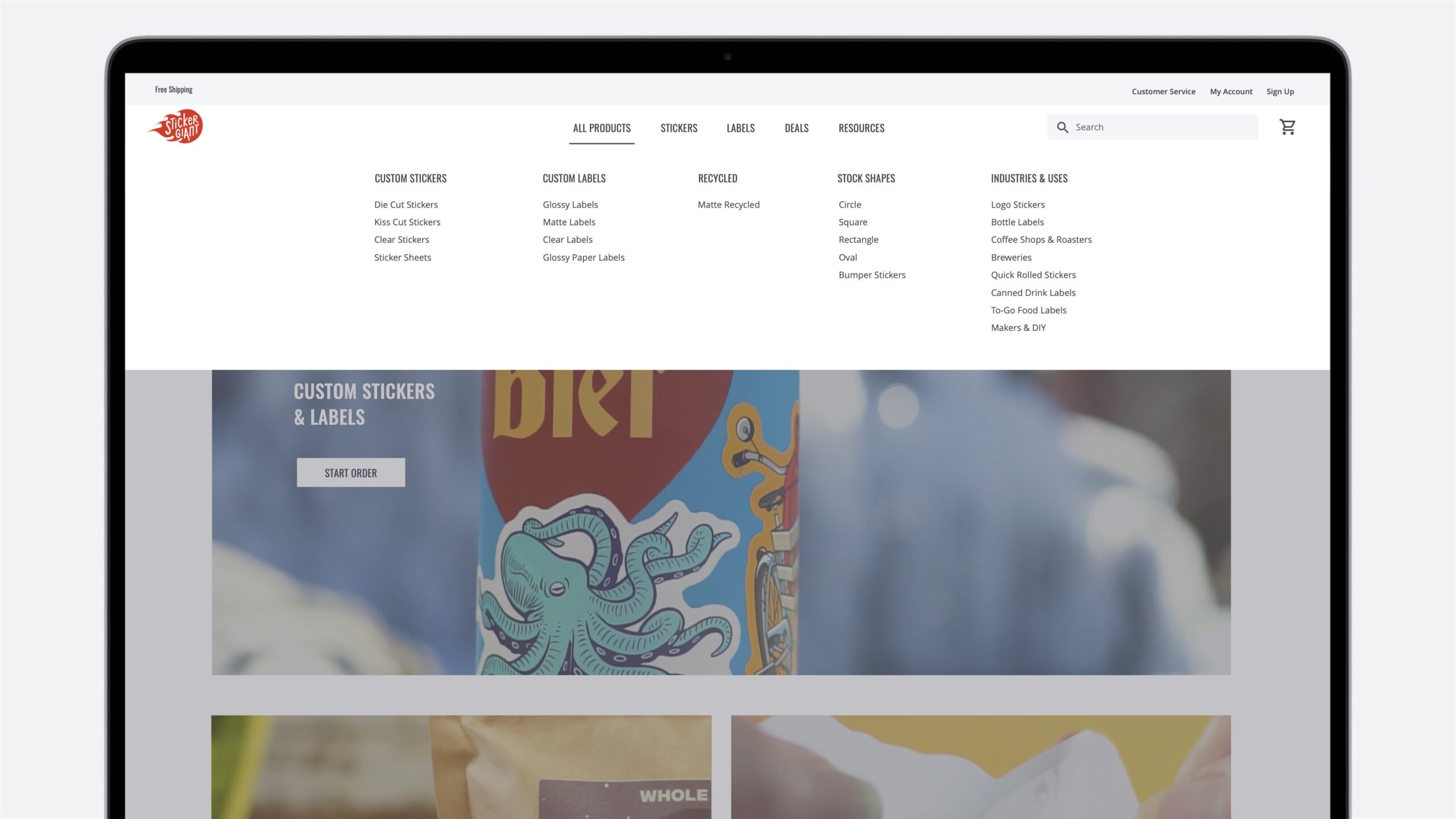
  • Main product categories
  • Mega menu IA
  • Deals are highlighted
  • Prominent search bar
  • About company info secondary (footer)

It’s all about the customer artwork–connecting user needs to business outcomes.

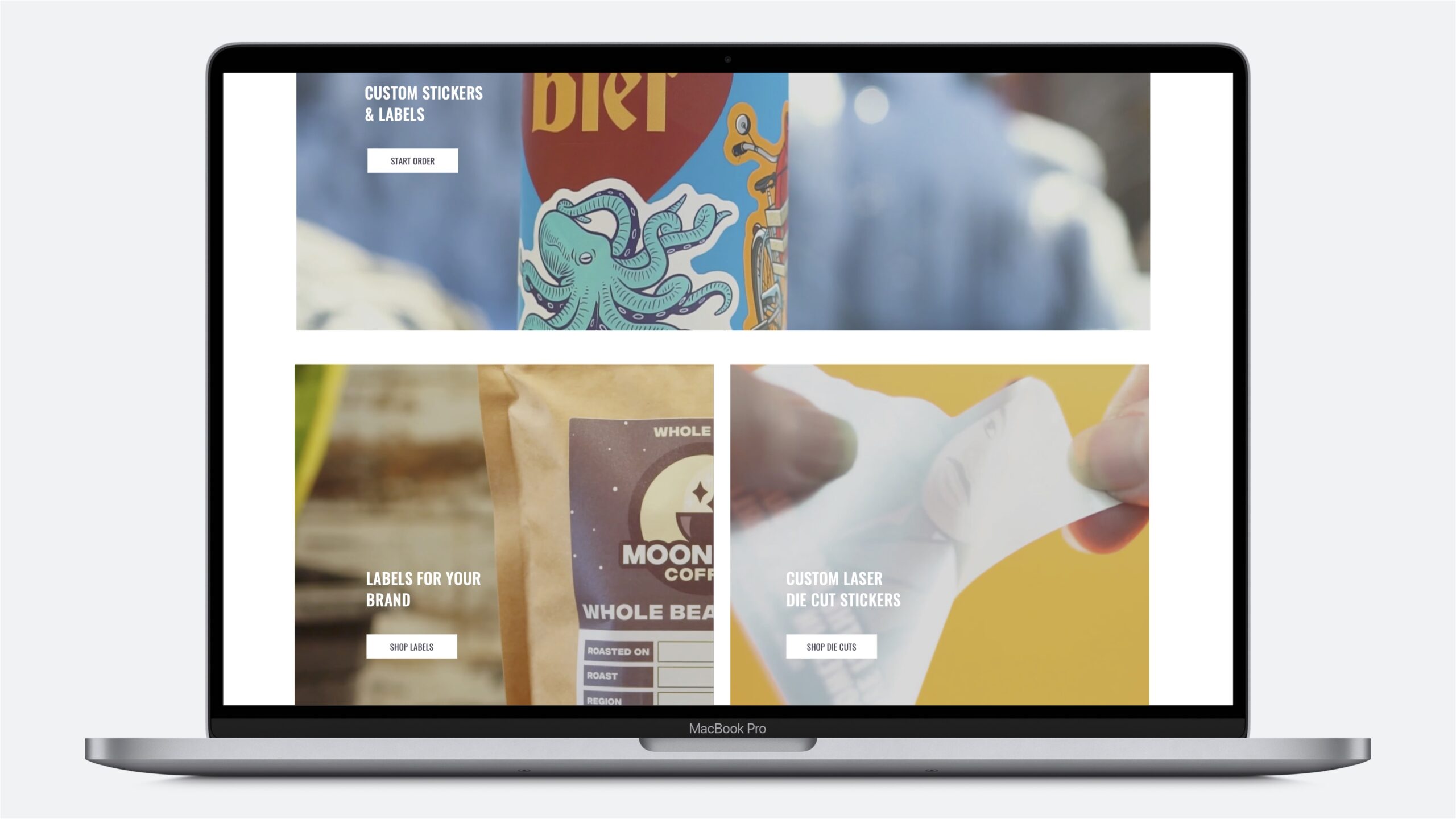
StickerGiant doesn’t just sell products–they sell materials and custom sticker and label printing for the customer’s artwork. This meant that instead of only showing sticker and label product types we needed to leverage realistic photos in context to show use cases throughout the ordering journey.

Layout and Imagery

A dynamic content grid to show to the good life of using sticker and label products. From user research we knew that customers always went to the site with a use case in mind.

Shop and Order

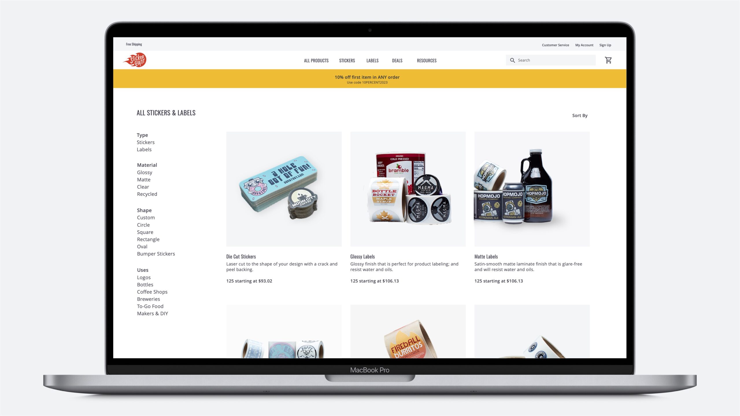
  • Products in a grid with consistent background
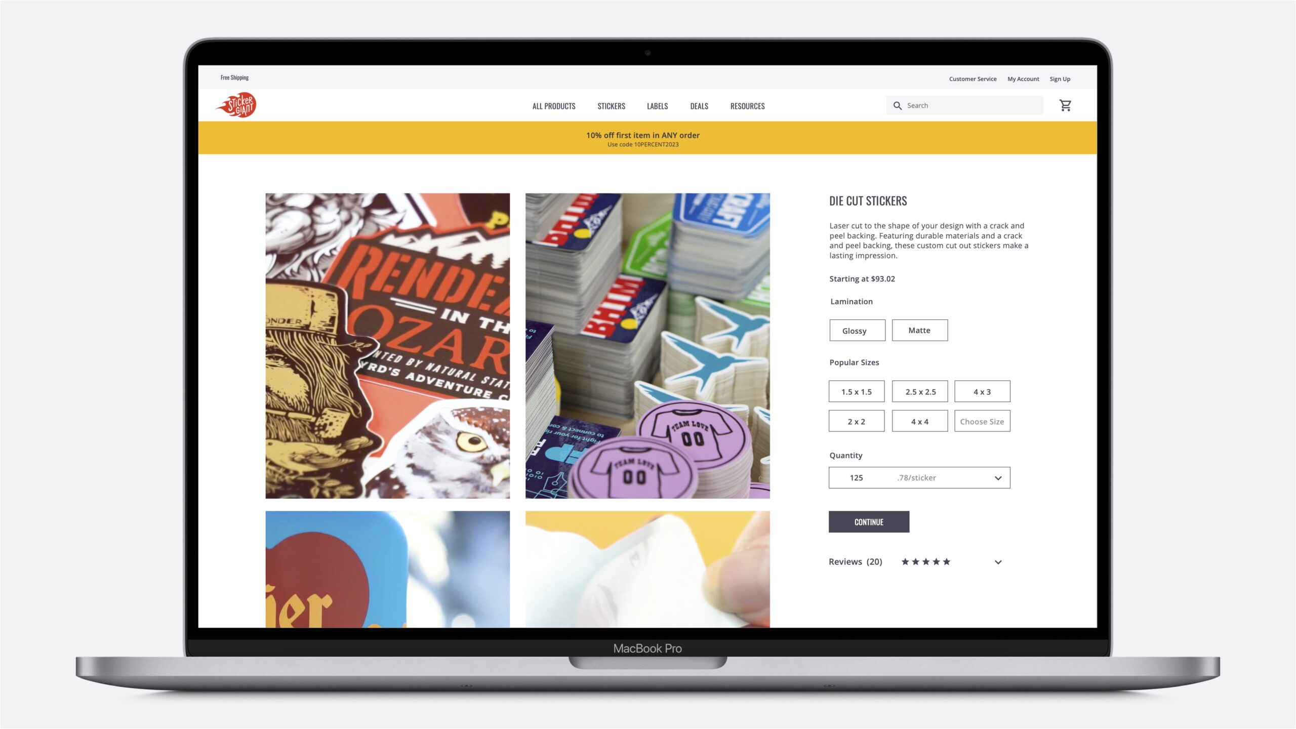
  • Clear, up-front pricing
  • Images guide the experience
  • All customizations on one page
  • Reviews along the way

Launch and Usability Testing

As part of the go-to-market team, I collaborated with our contract engineers throughout development to review designs, configure and customize plugins, test orders, and to advocate for the end user–our customers.
I interviewed 10 total hired user participants in user studies for target customers segments to test, provide feedback, and compare our site to three direct top competitors. These findings pointed the way to our feature roadmap to continuously improve the user experience for increased conversions.
18-65 aged, normal individual customers (etc. volunteer, personal project)
25-65, aged small business owners and employees (ex. bakery owner, office manager)

Findings to inform the feature roadmap

  • PDP detail layouts and icons instead of long copy
  • Users aren’t familiar with industry terms like die cut and kiss cut
  • Customers are motivated by use case, material, and price instead of product name/type
  • Description phrases to help the customer differentiate between product types on listing pages
  • Customer artwork previews
  • Connecting material feature images to uploaded file
  • Showing products above the fold

Results

63%

user engagment reached

54K

monthly users

12%

decrease in bounce rate

One-Page Checkout