CASE STUDY
Visual Grid Design
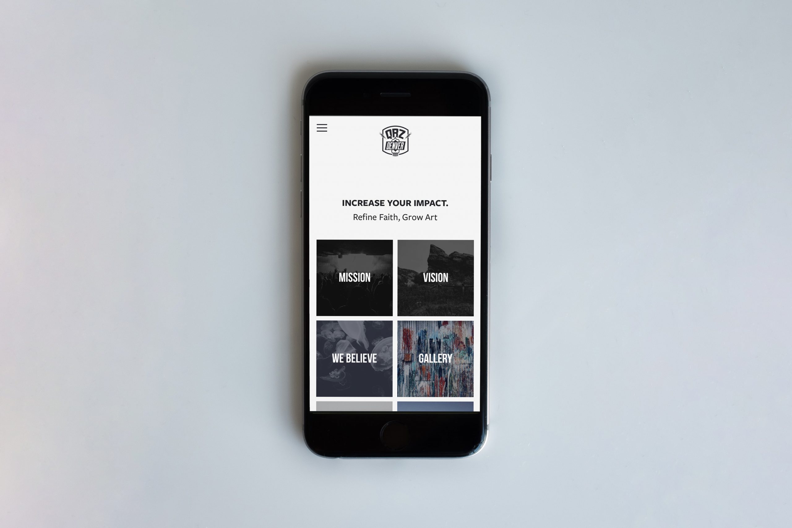
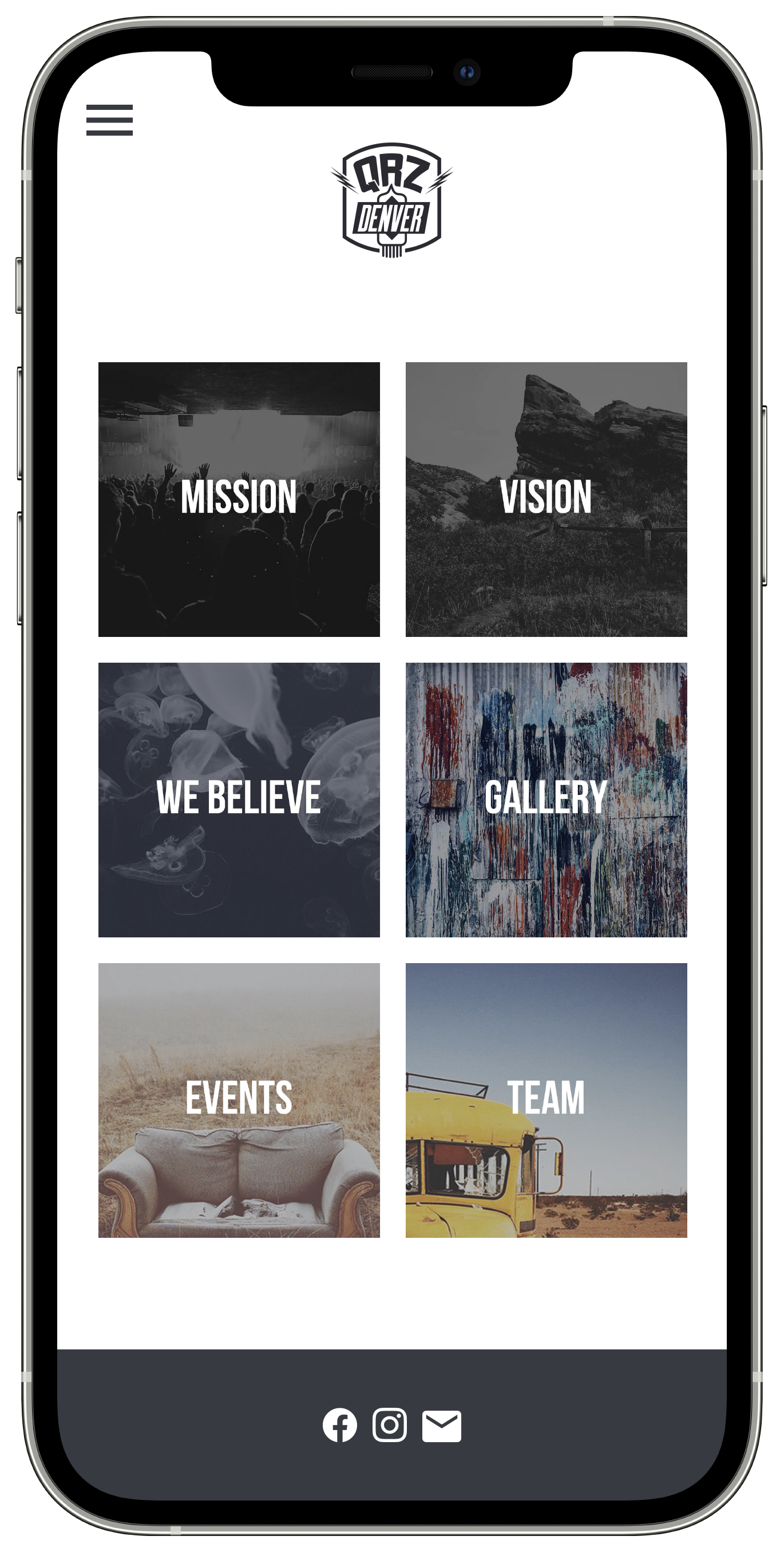
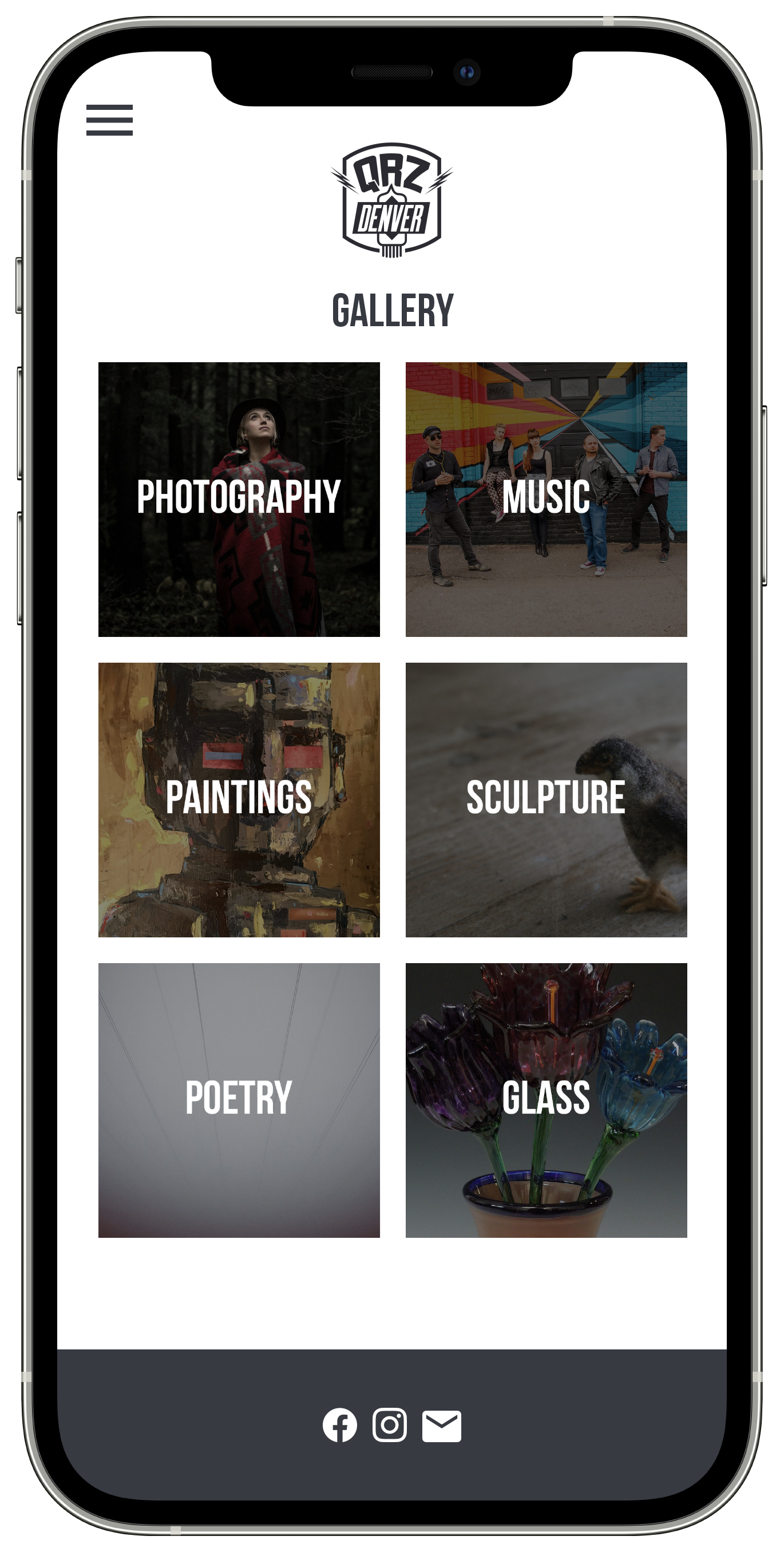
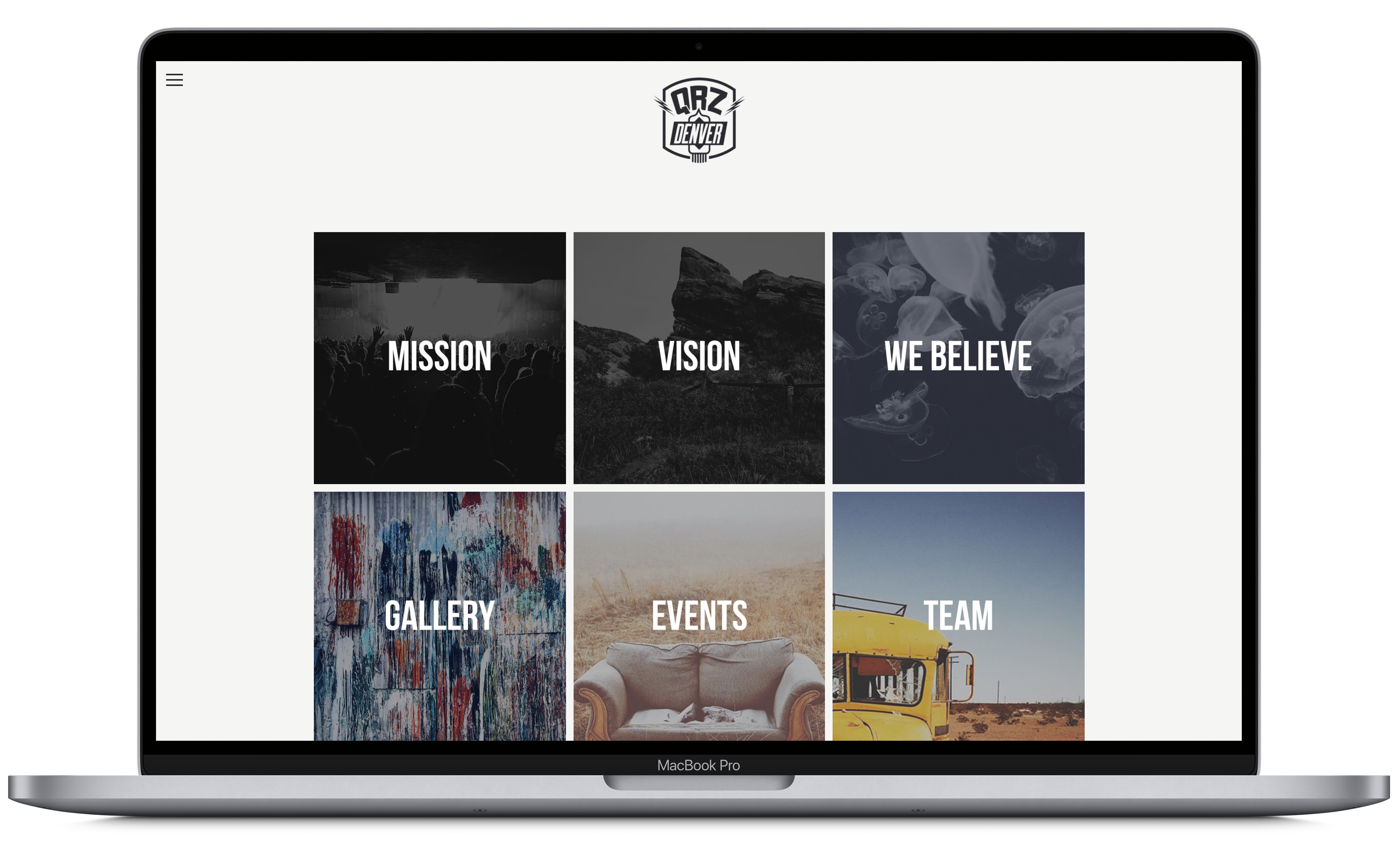
A grid navigational layout and design.
I designed an inviting website for QRZ Denver, and trained their staff to maintain it, helping increase their impact to grow art within the city.
The organization needed a platform to share their story, display different art mediums, and connect users with their creative community events.
Role
UX Strategy
UI Design
Usability Testing
Web Development
Goals
Challenges
Target Audience
Ideate
I began the design process by asking these questions: How can I tell a story through a web experience? What are the visual cues that can represent QRZ Denver digitally?
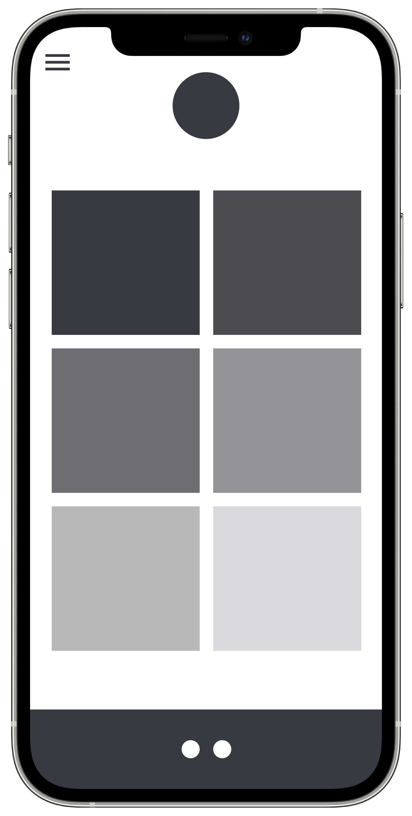
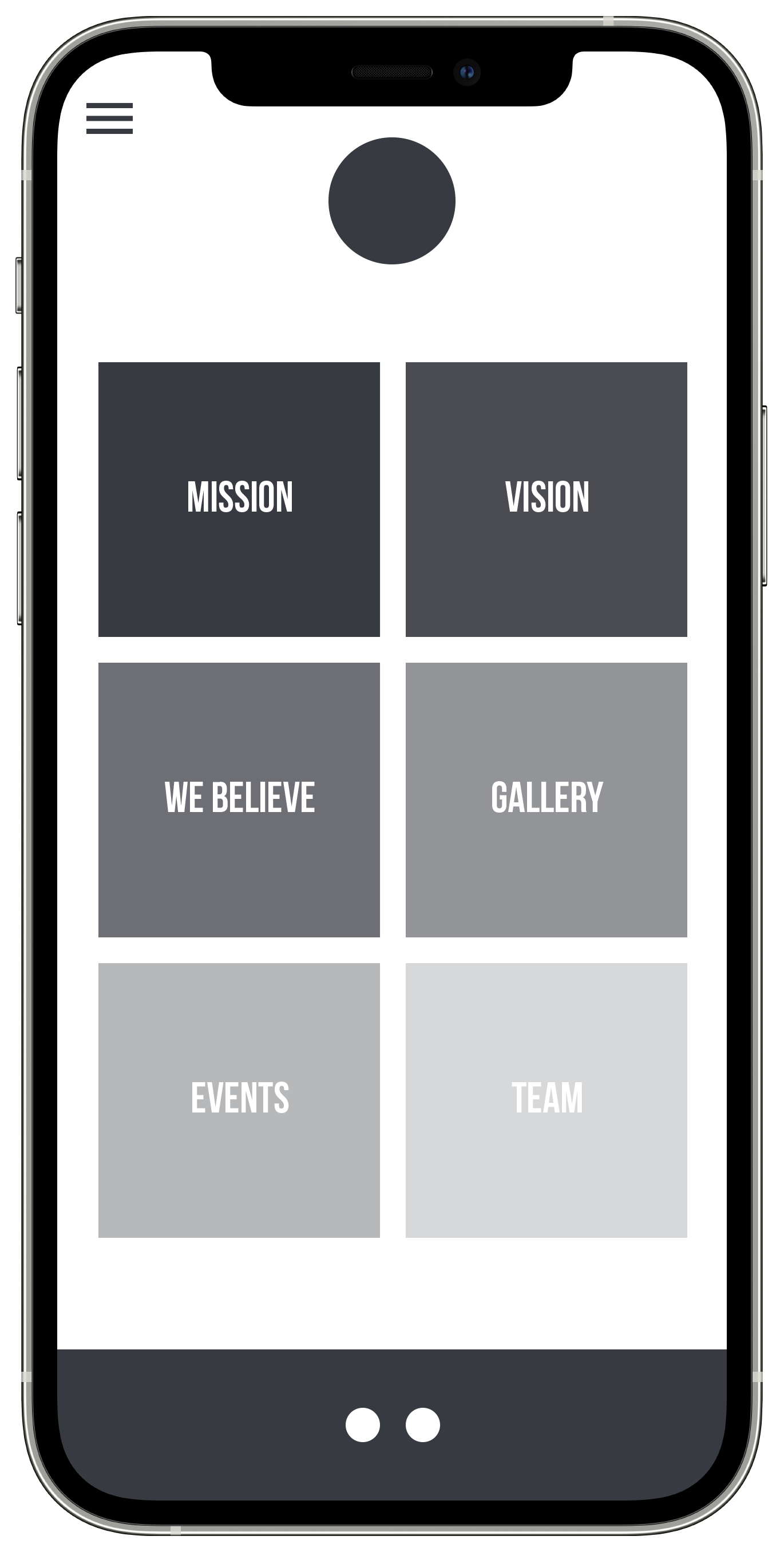
I developed a visual navigational strategy to represent QRZ’s mission to bring hope through art with color tones moving from dark to light.
Wireframes
Visual UI Design & Prototypes
Findings
Results
2.3K
pageviews each year
500
unique visitors each year
16
featured artists at launch
